Client. Argo
Services. Naming, Visual Identity, Print Design
Agency. Caramel Creative
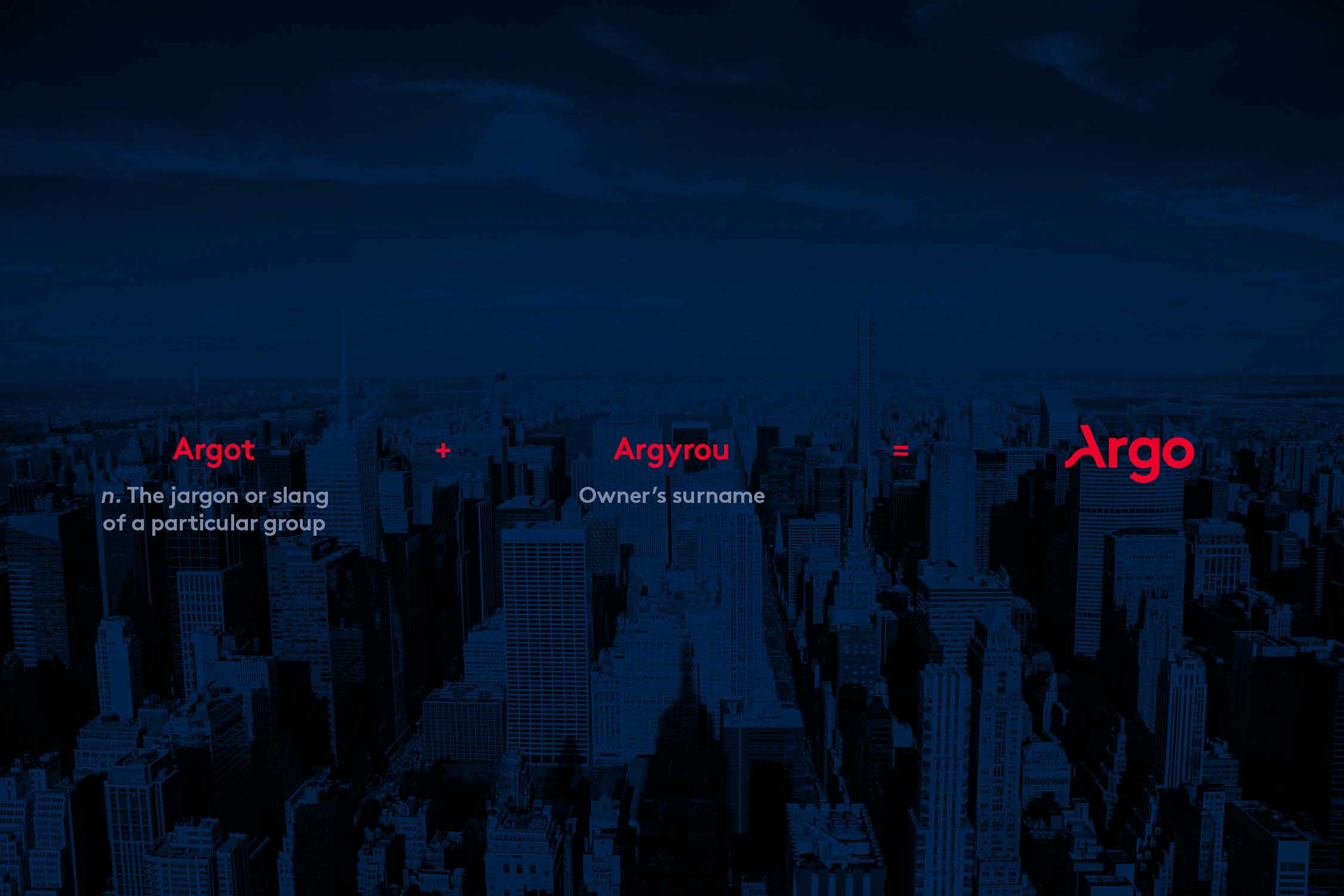
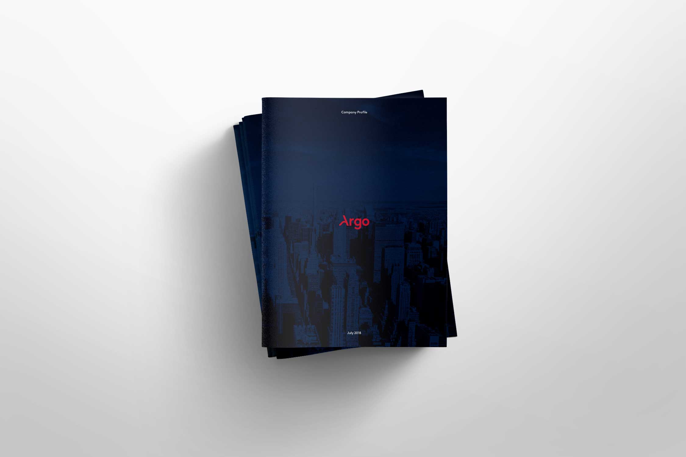
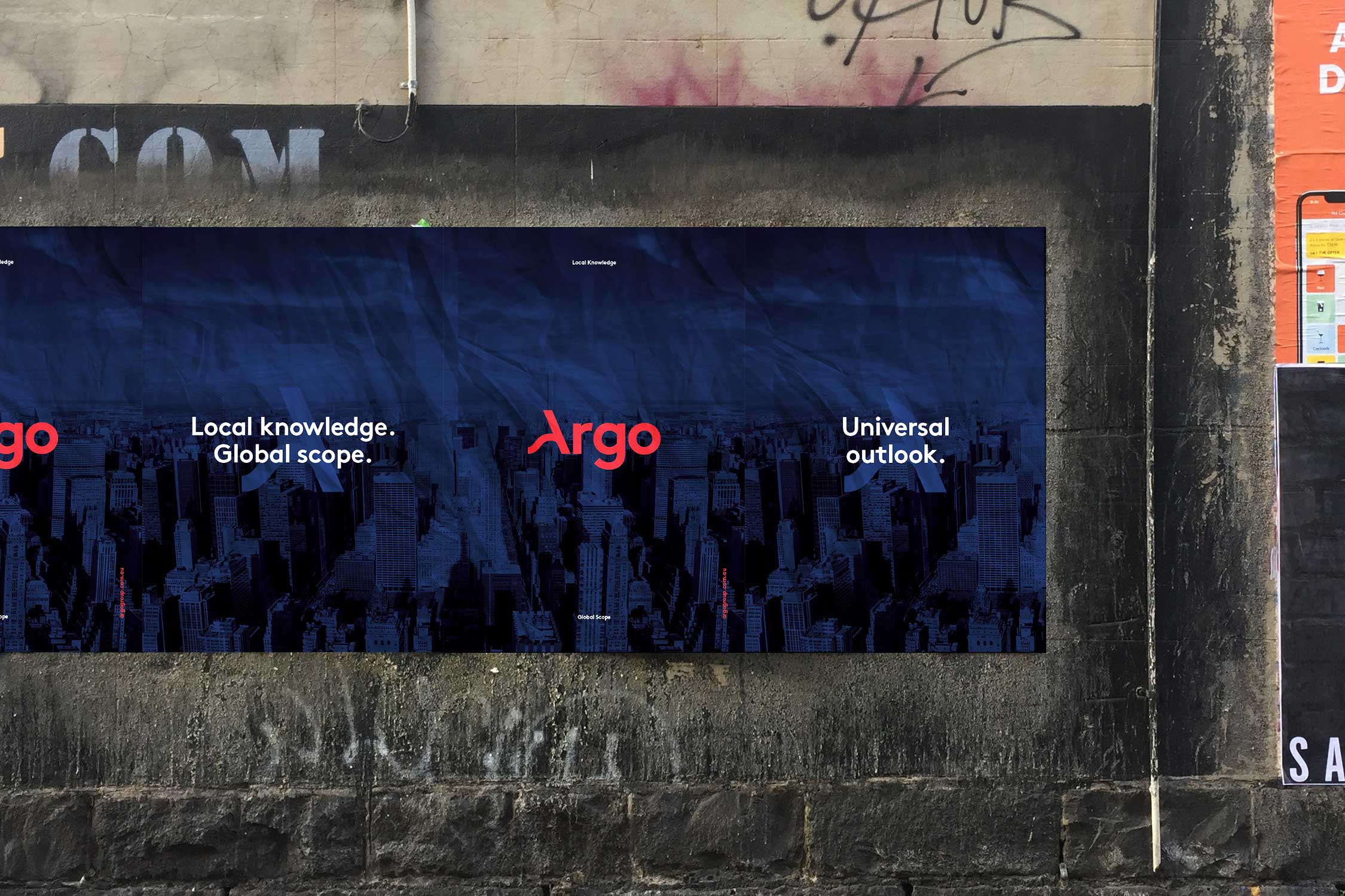
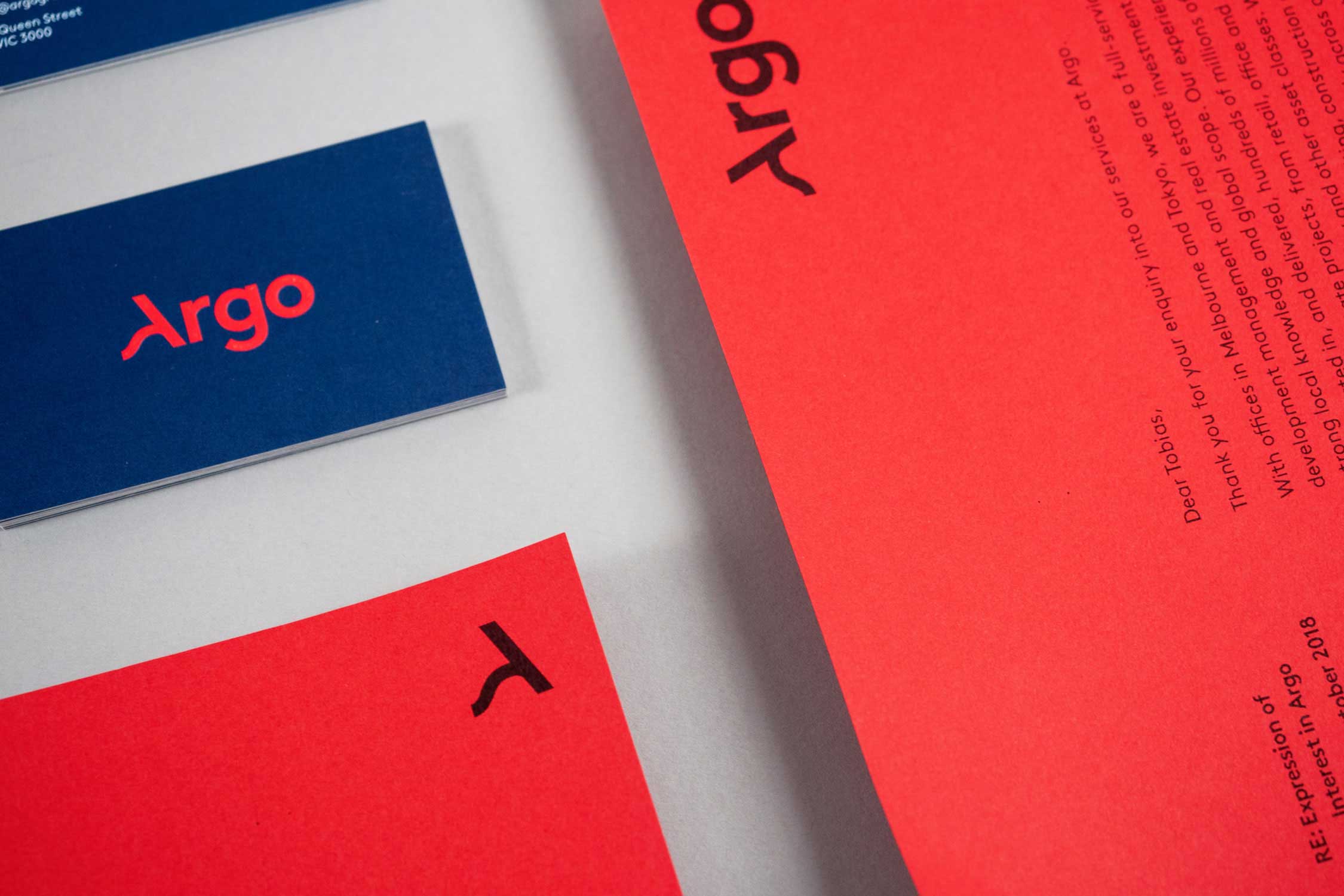
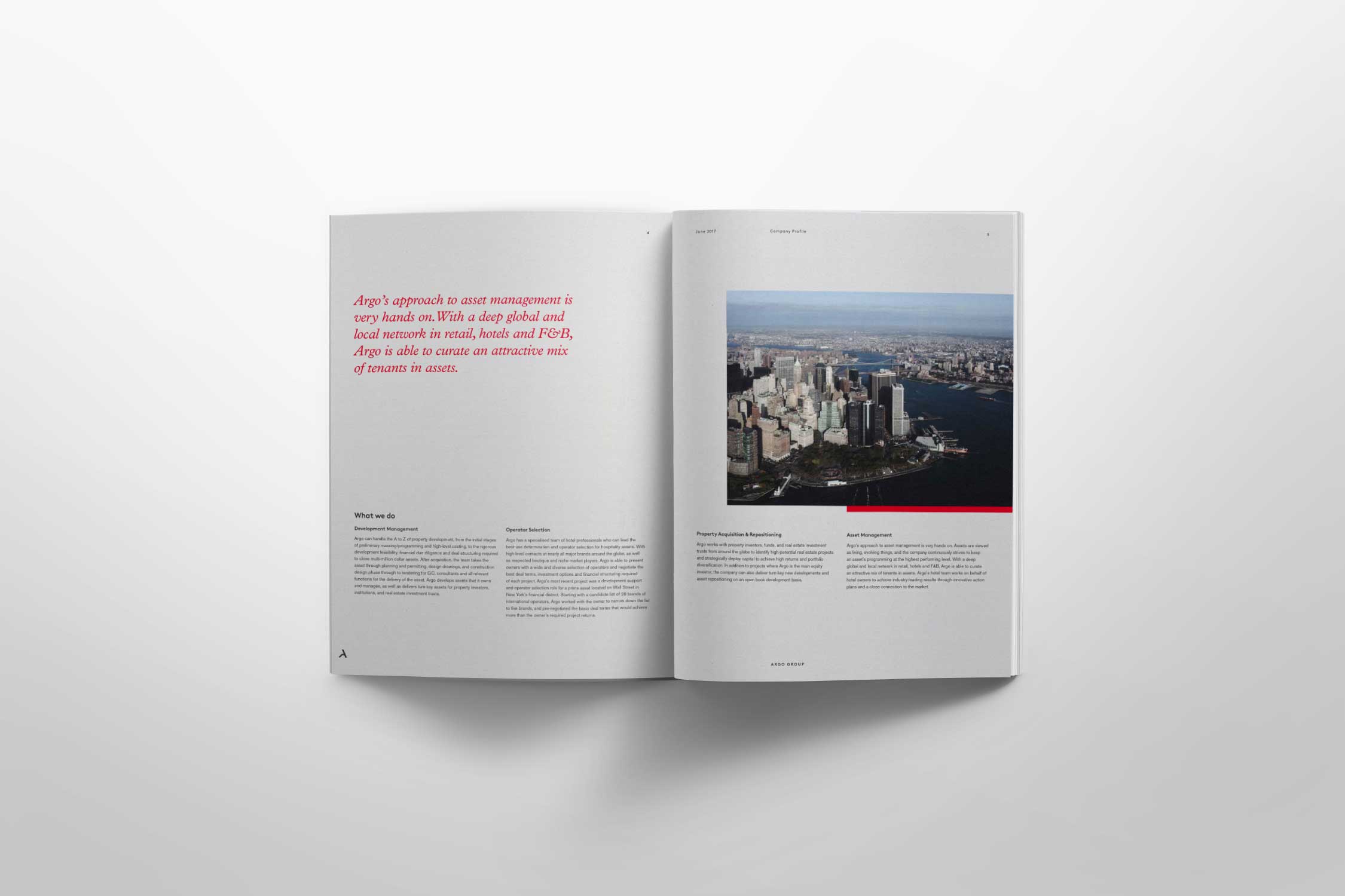
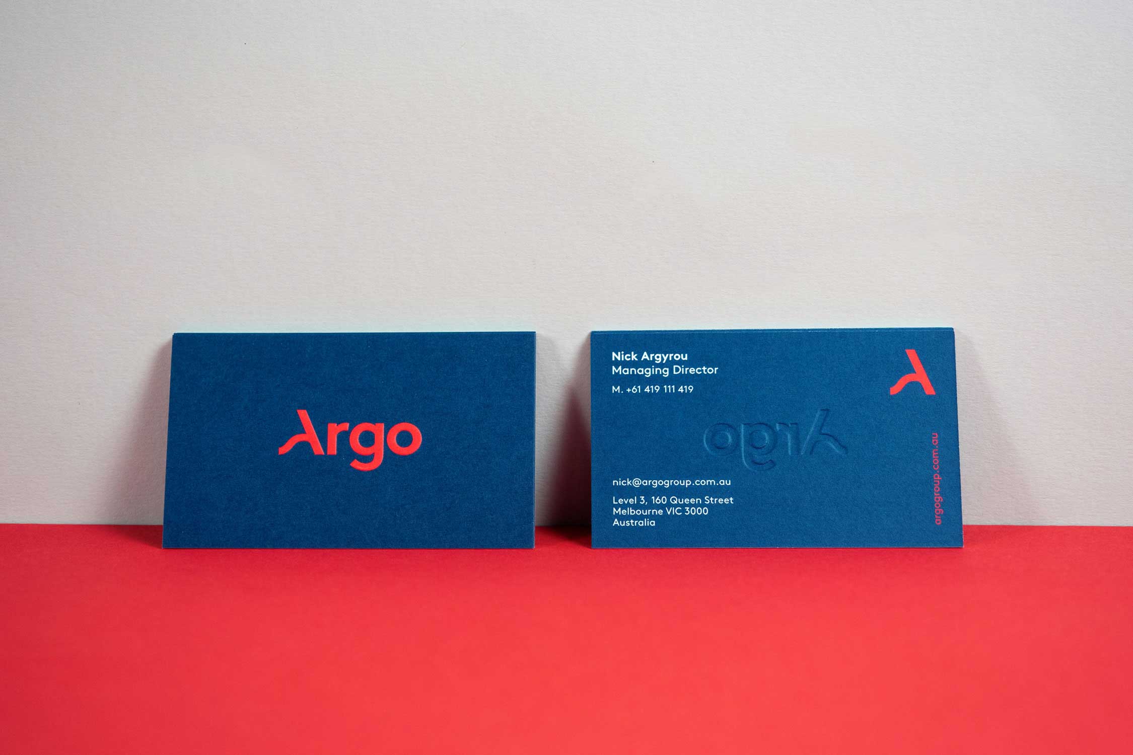
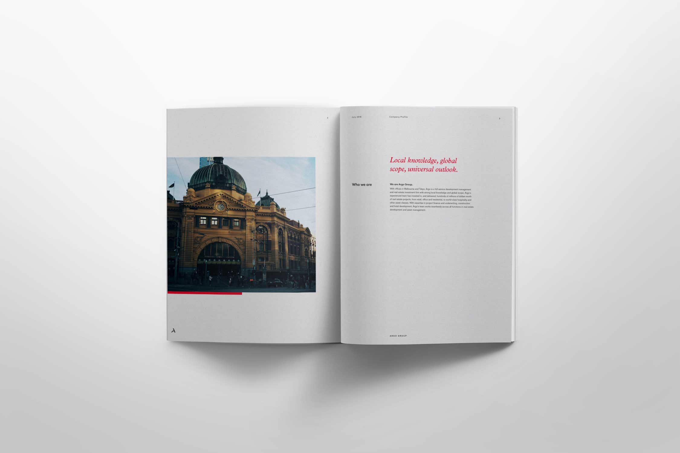
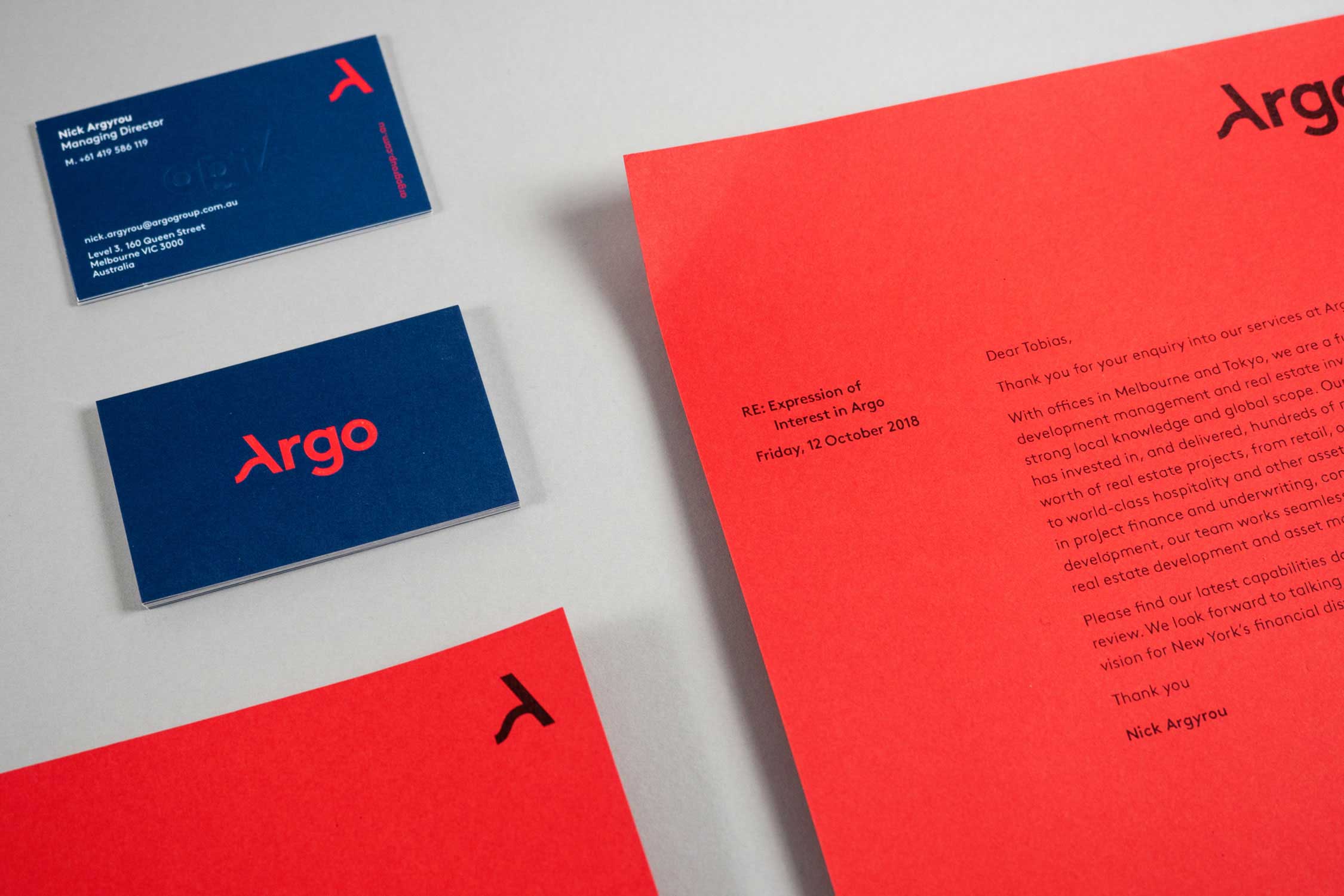
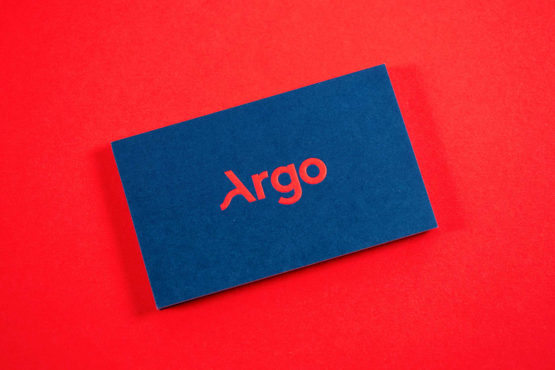
A start-up seeking to become a leader in the management of property development, Argo were looking for naming and visual identity. With a strong history in the property and built environment, Argo’s offering is unique and niche, and deserved to be acknowledged through their business name. Through deep exploration the result was a combination of the founder and terminology used within the group.
Key themes and values were explored and communicated through a custom wordmark. The structured typography represents the output of building and architecture, whilst the flow of the brandmark's 'A' shows the agility and flexibility of the company. The contemporary yet sophisticated feel was achieved through bold use of colour.


SELECTED PROJECTS
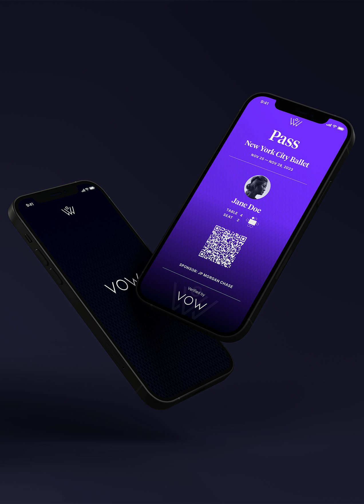
VOWVisual Identity

RecoverieVisual Identity
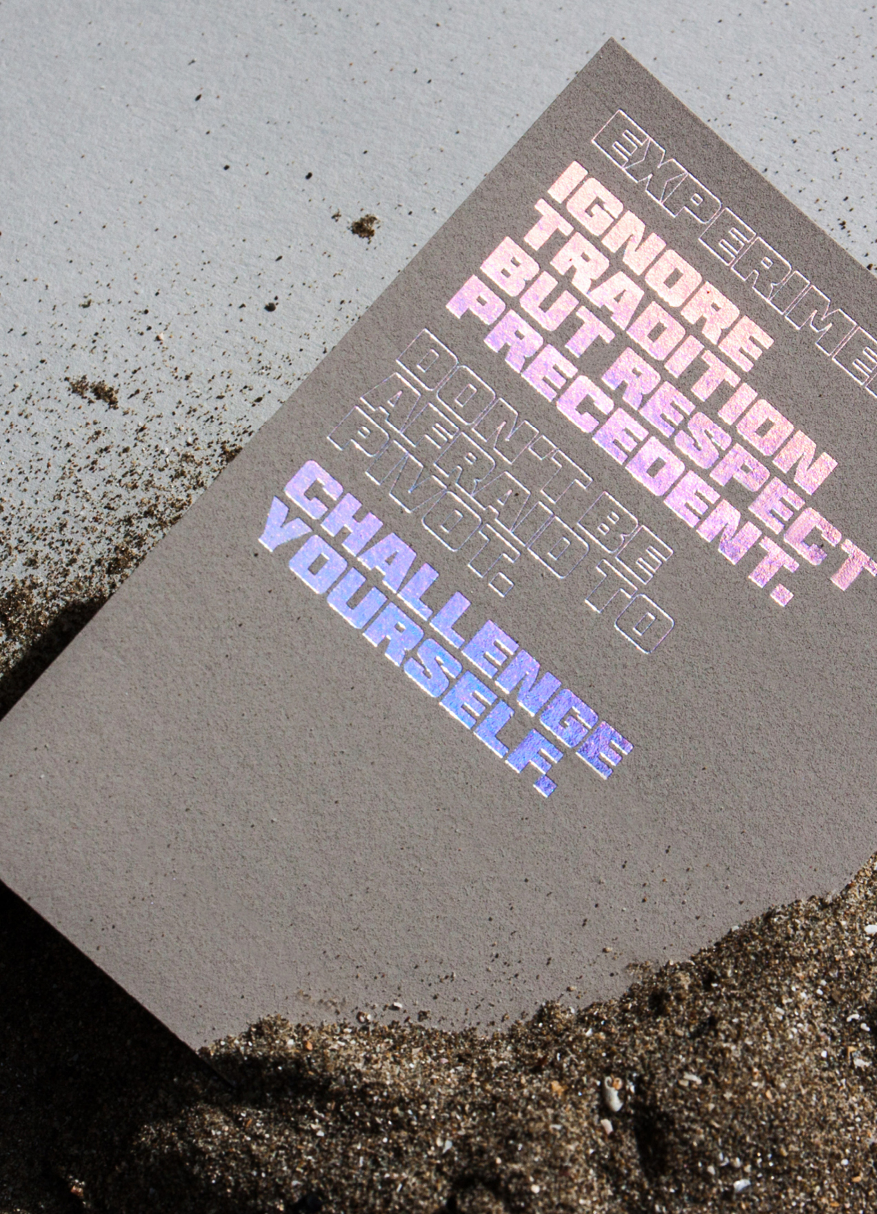
HHHI,Visual Identity, Packaging Design, Print Design
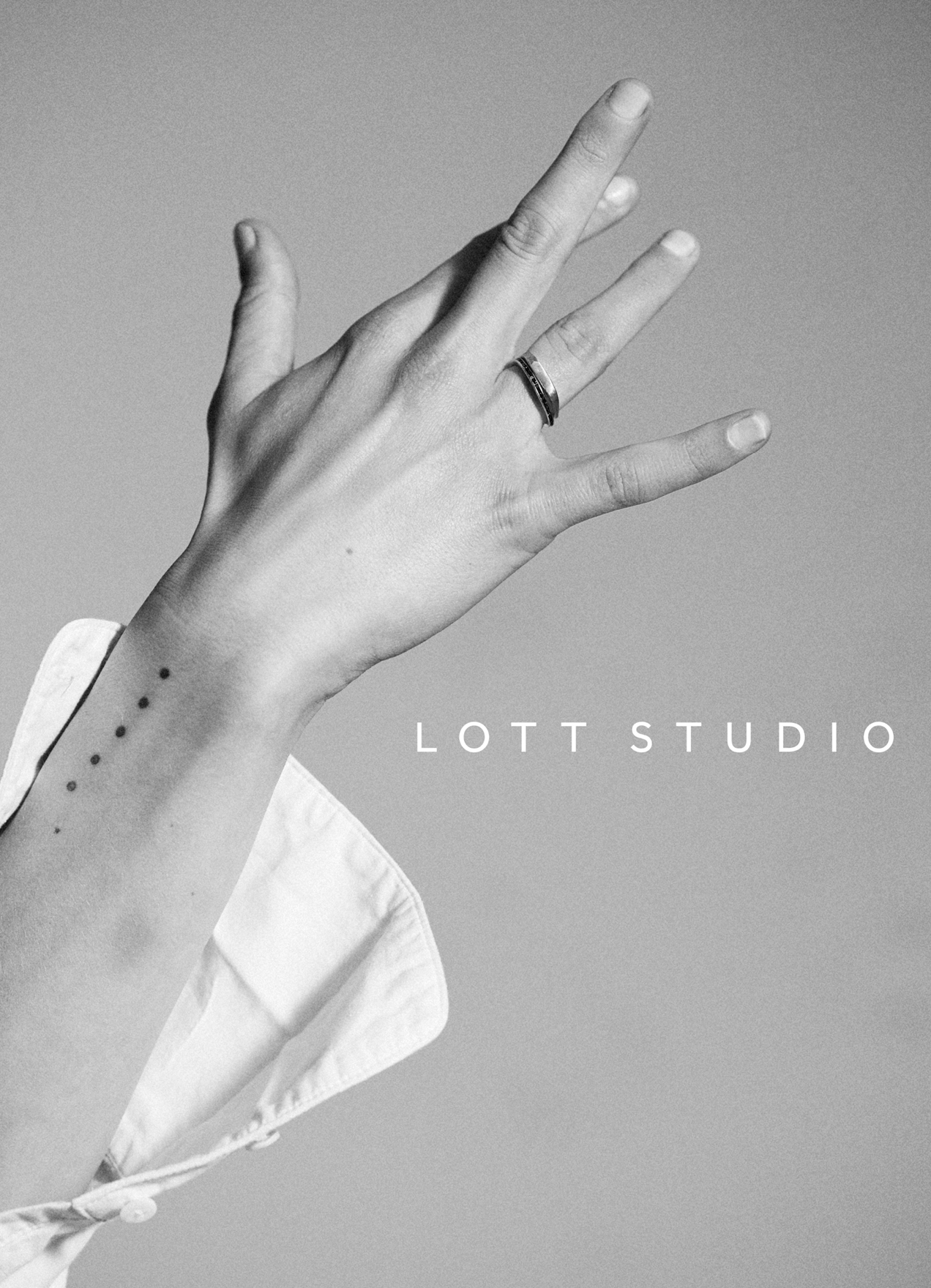
Lott StudioVisual Identity, Print Design
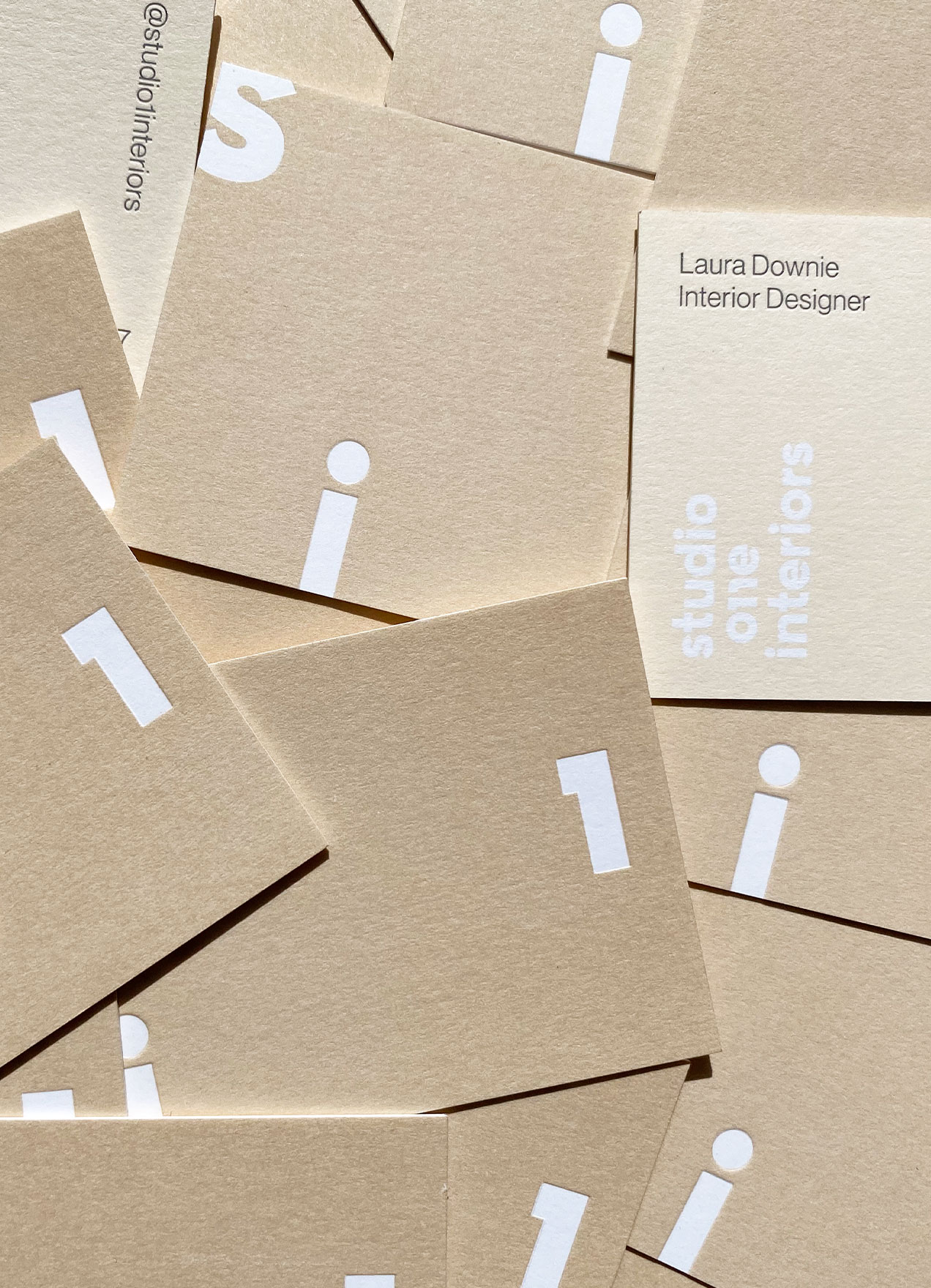
Studio 1 InteriorsVisual Identity, Print Design

Skinfood AgelessVisual Identity, Packaging Design

Wedding StationeryCreative Direction, Print Design
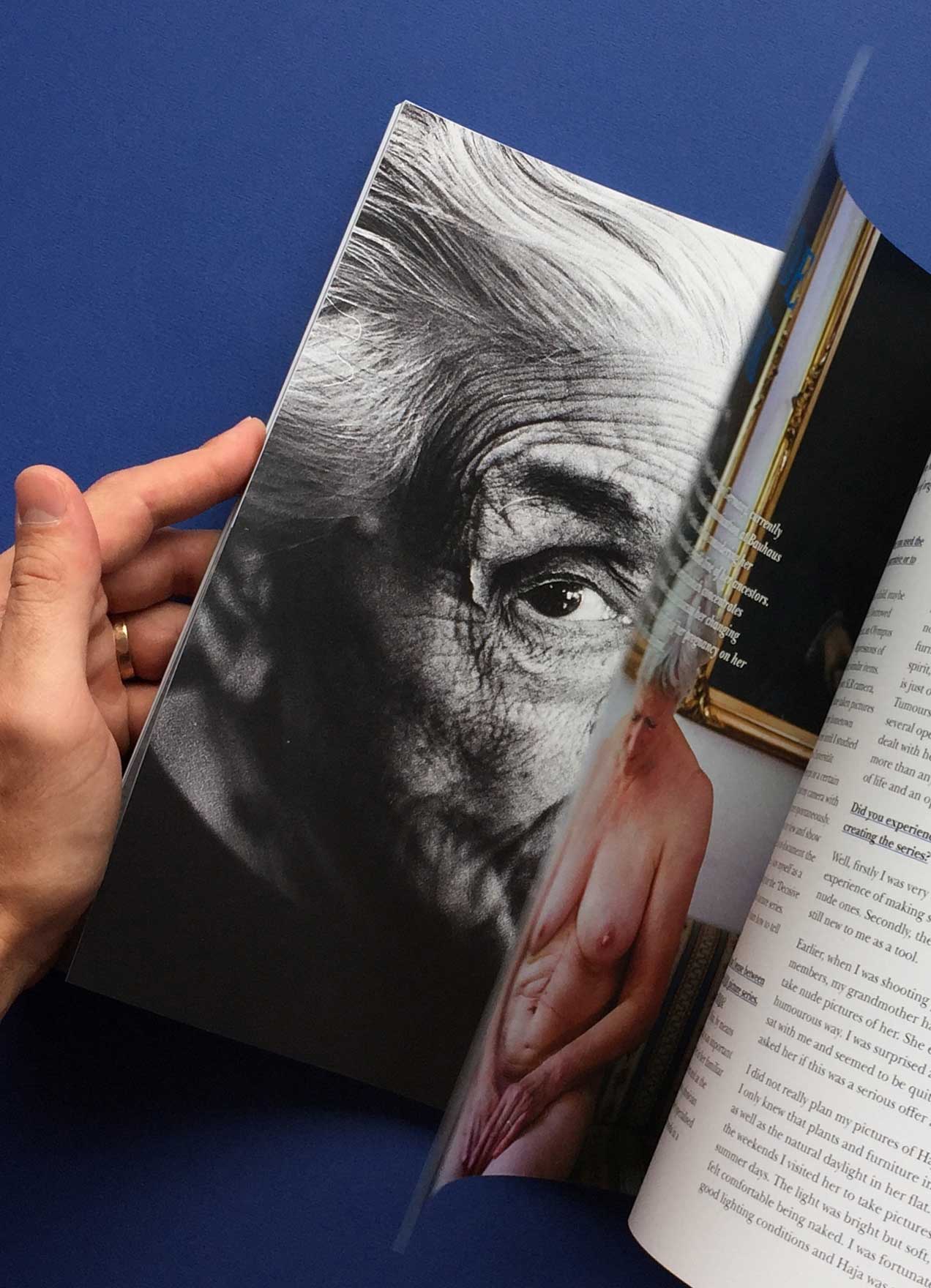
She Shoots FilmVisual Identity, Editorial Design

DesigntreeNaming, Visual Identity, Print Design
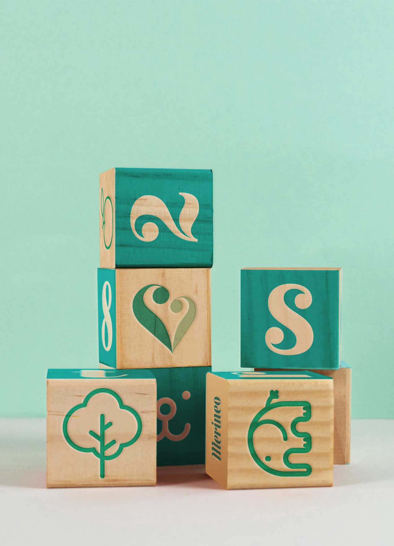
MerineoNaming, Visual Identity, Print Design

Chapter HouseVisual Identity, Print Design
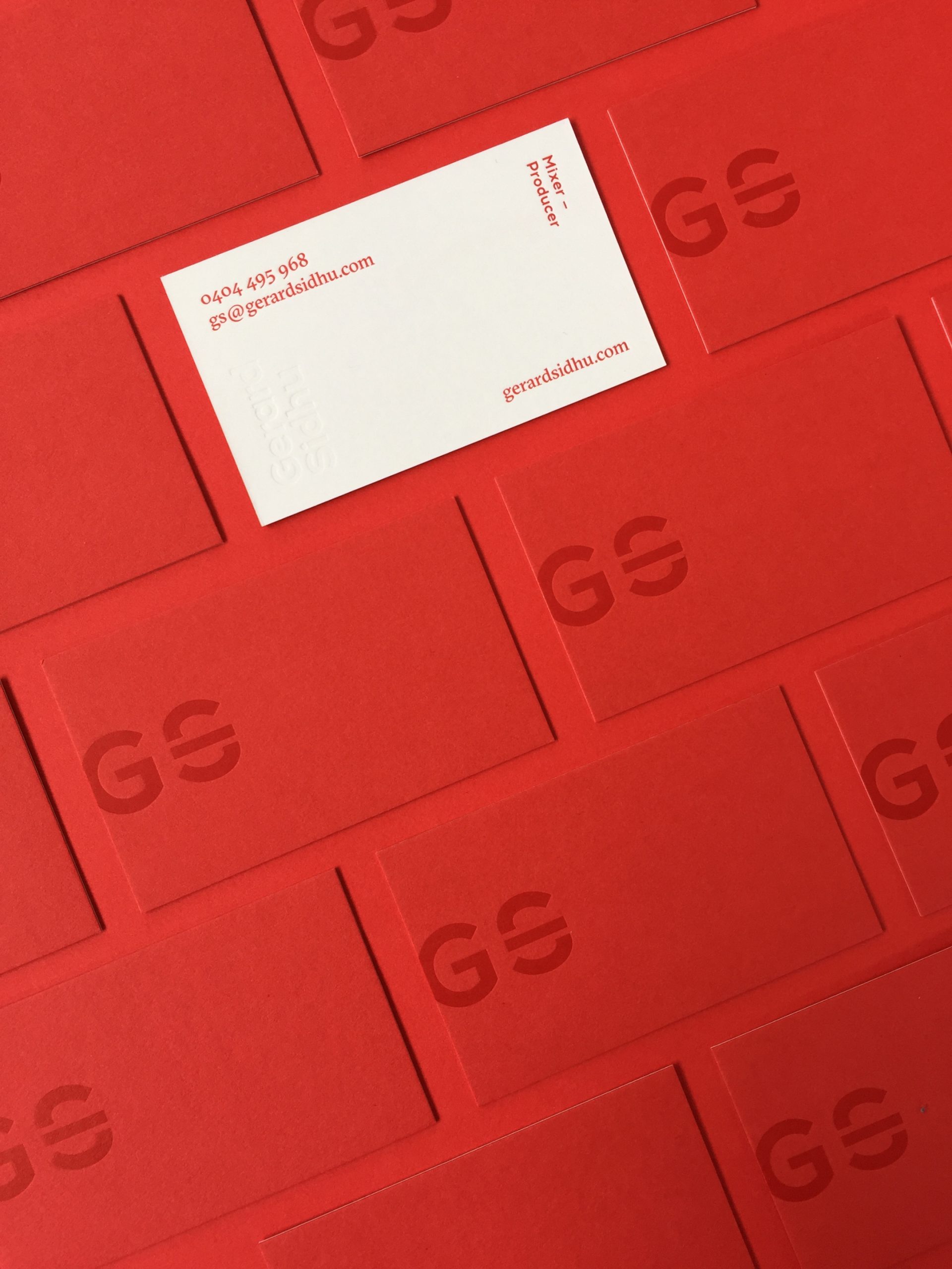
Gerard SidhuVisual Identity, Print Design
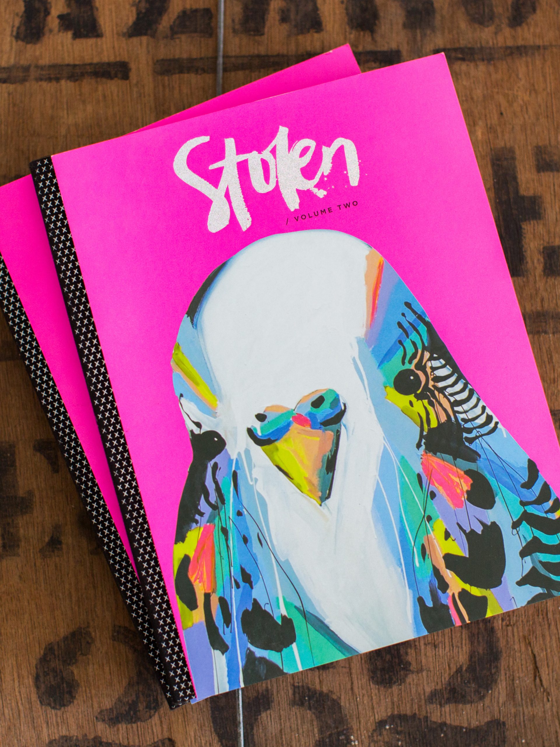
Stolen PublicationsCreative Direction, Visual Identity, Editorial Design