Client. Merineo
Services. Naming, Visual Identity, Print Design
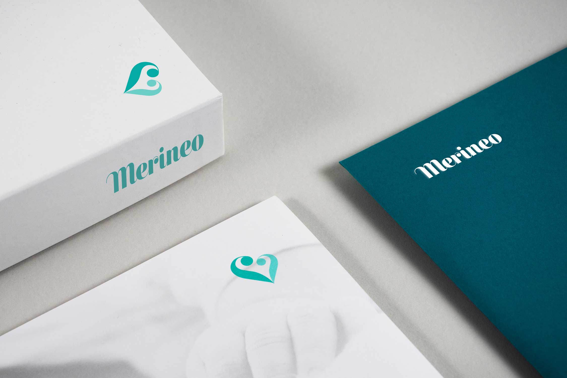
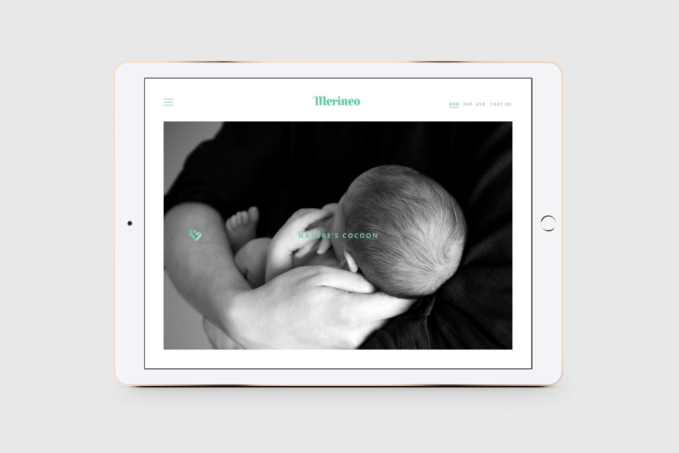
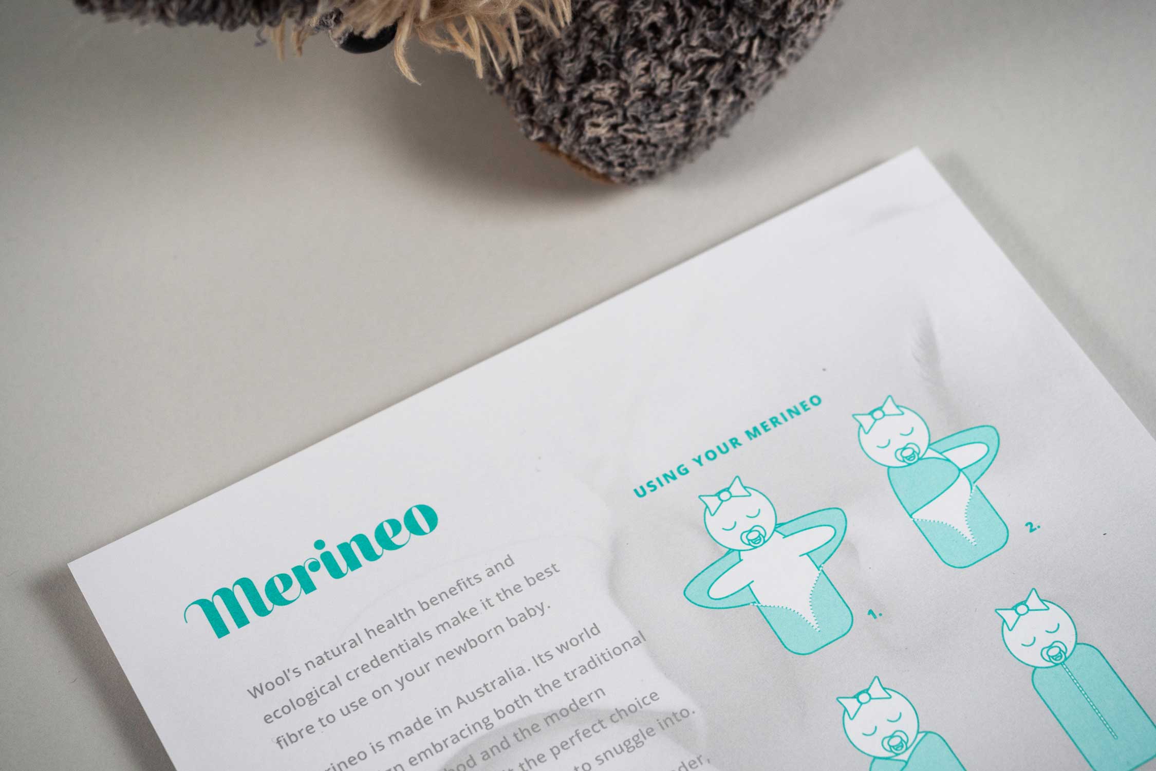
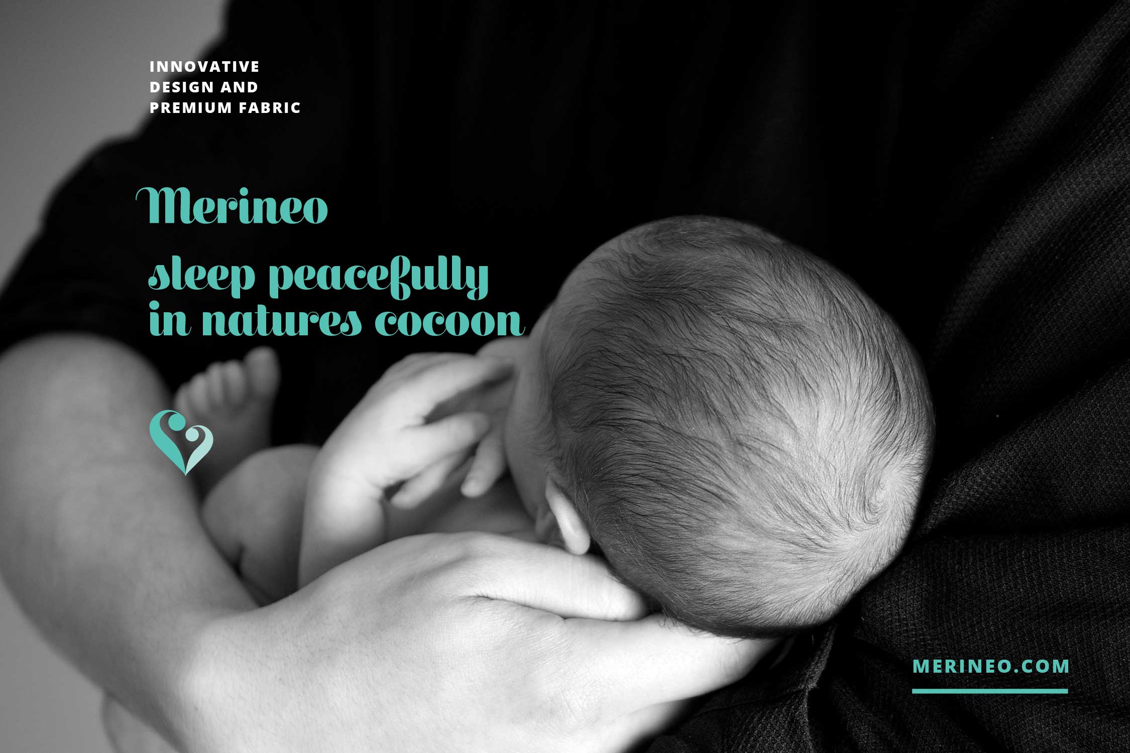
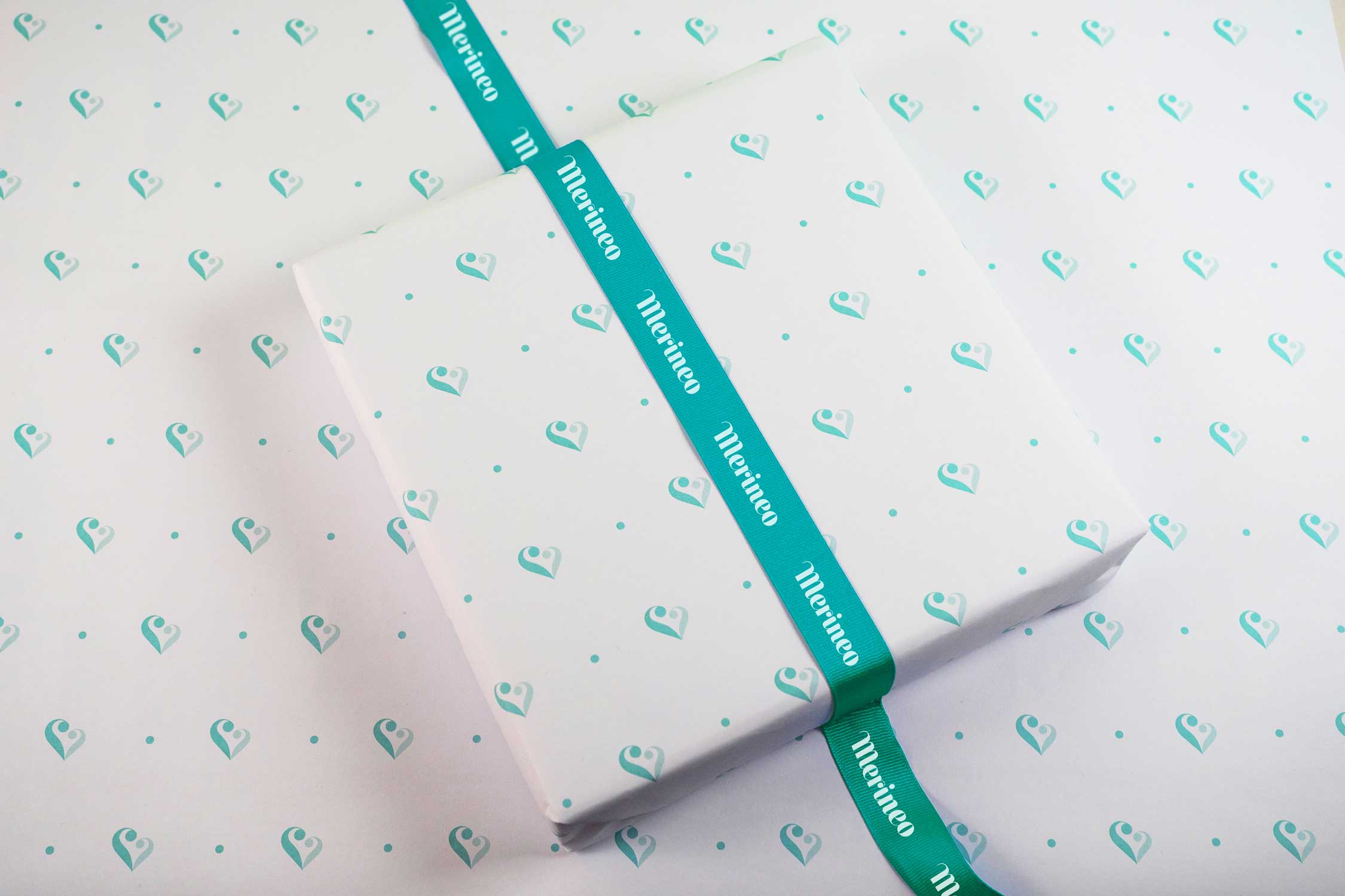
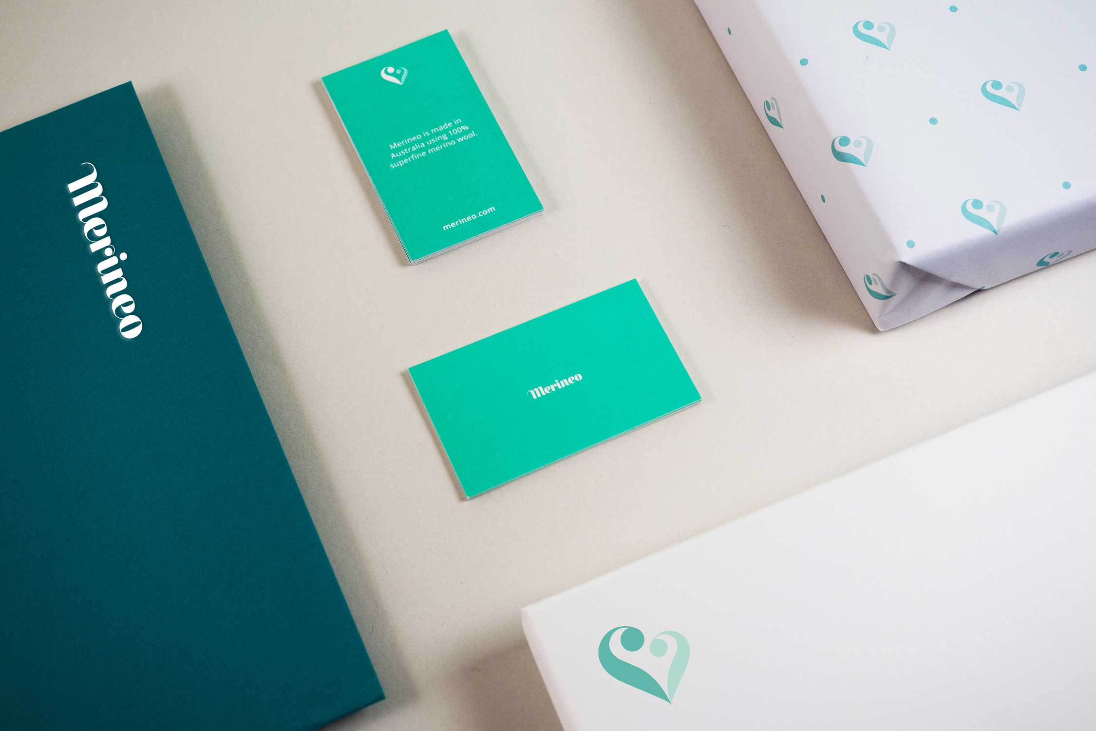
Merineo is a start-up baby brand focussing on Australian-made merino wool products and providing a functional yet modern approach to health and wellbeing for newborns.
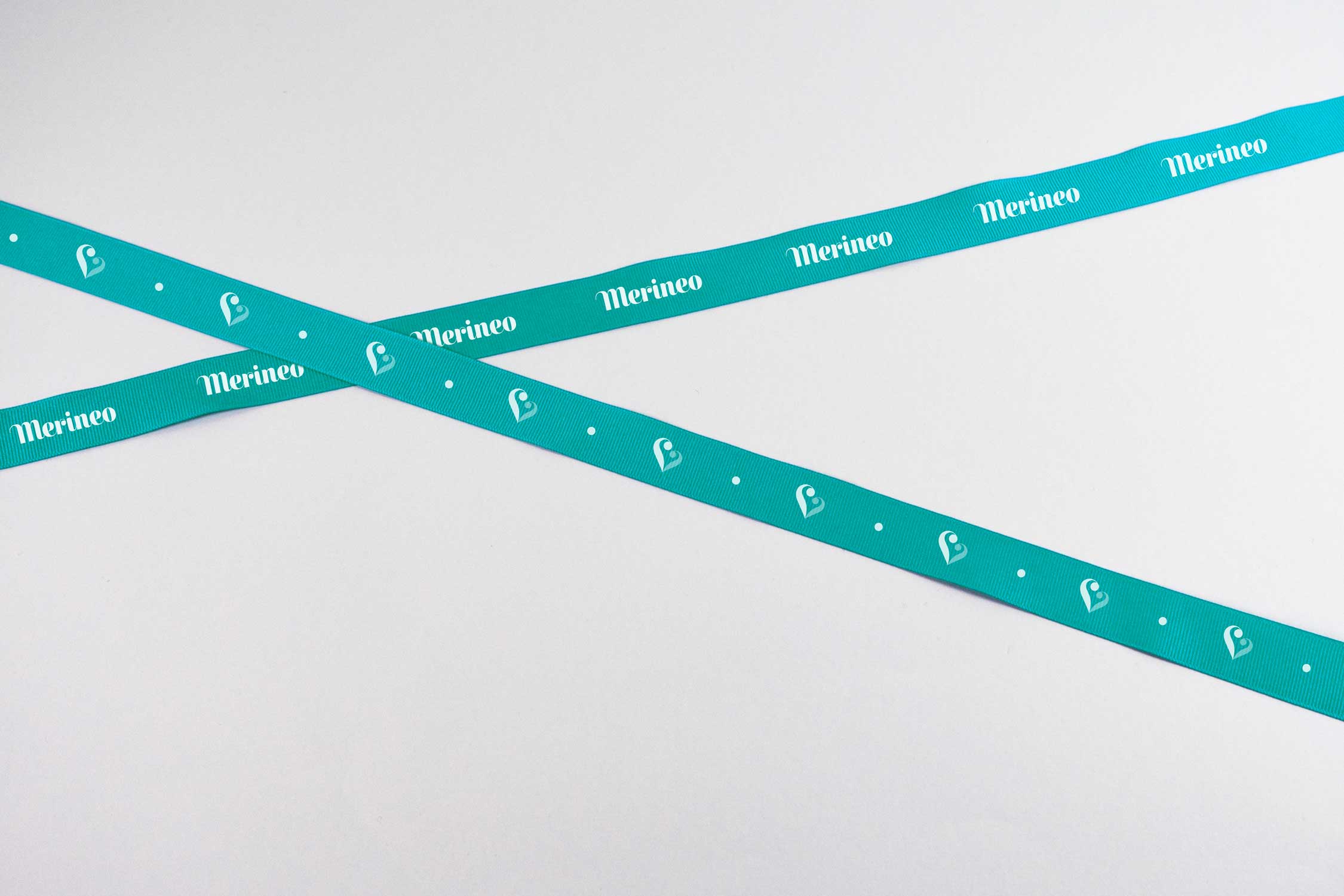
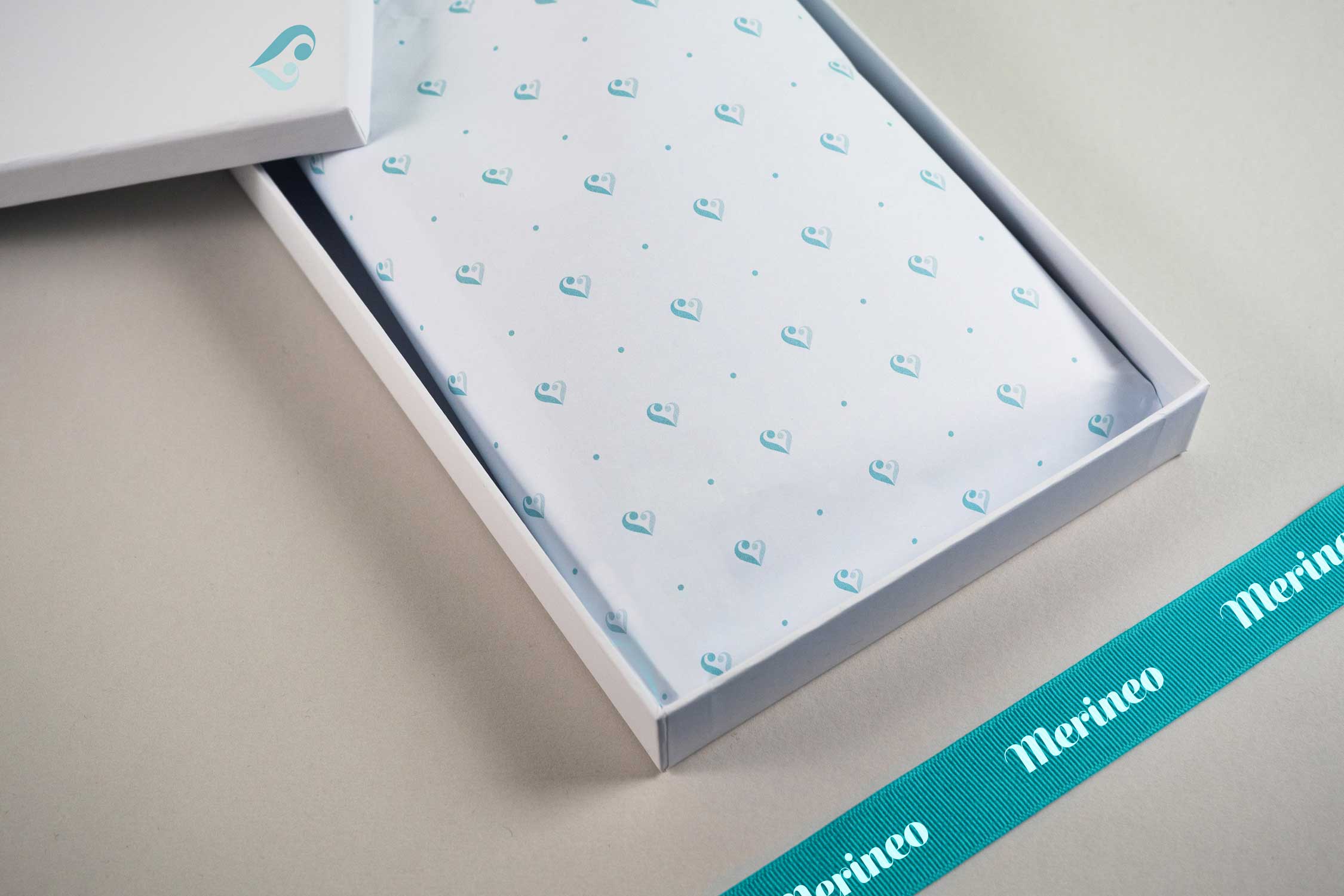
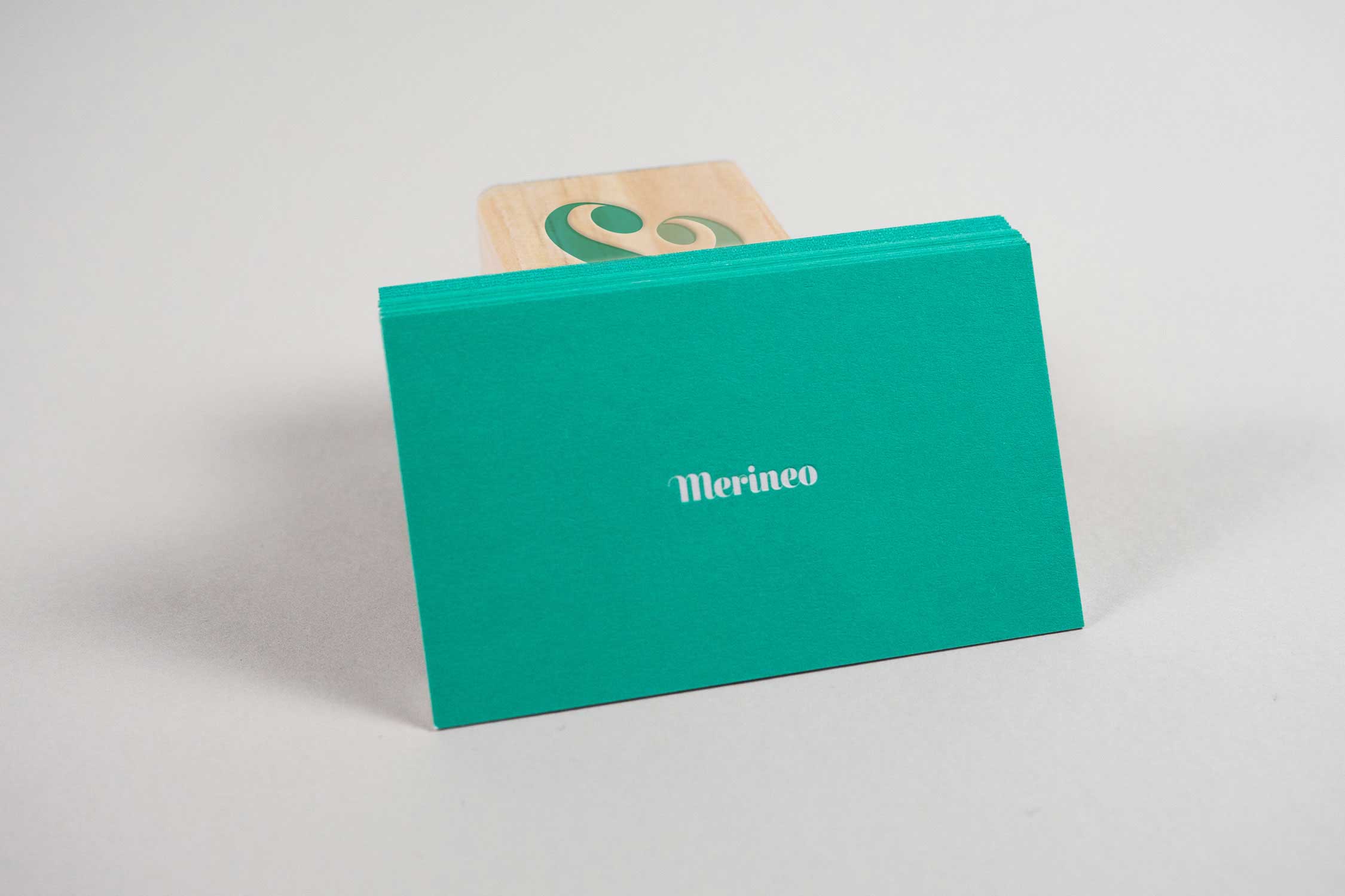
The name Merineo is a fusion of the core product, a merino wool sleep sack, and a newborn baby, neo. The heart icon is a contemporary typographic deconstruction, taking visual cues from the serif typeface used in the wordmark, and depicts the bond between a parent and their child. Across collateral, the application is minimal in approach and prioritises the colour green, which studies reveal as a calming, refreshing and nurturing colour for babies.

SELECTED PROJECTS
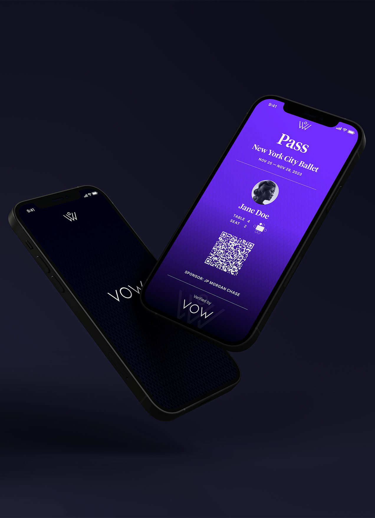
VOWVisual Identity
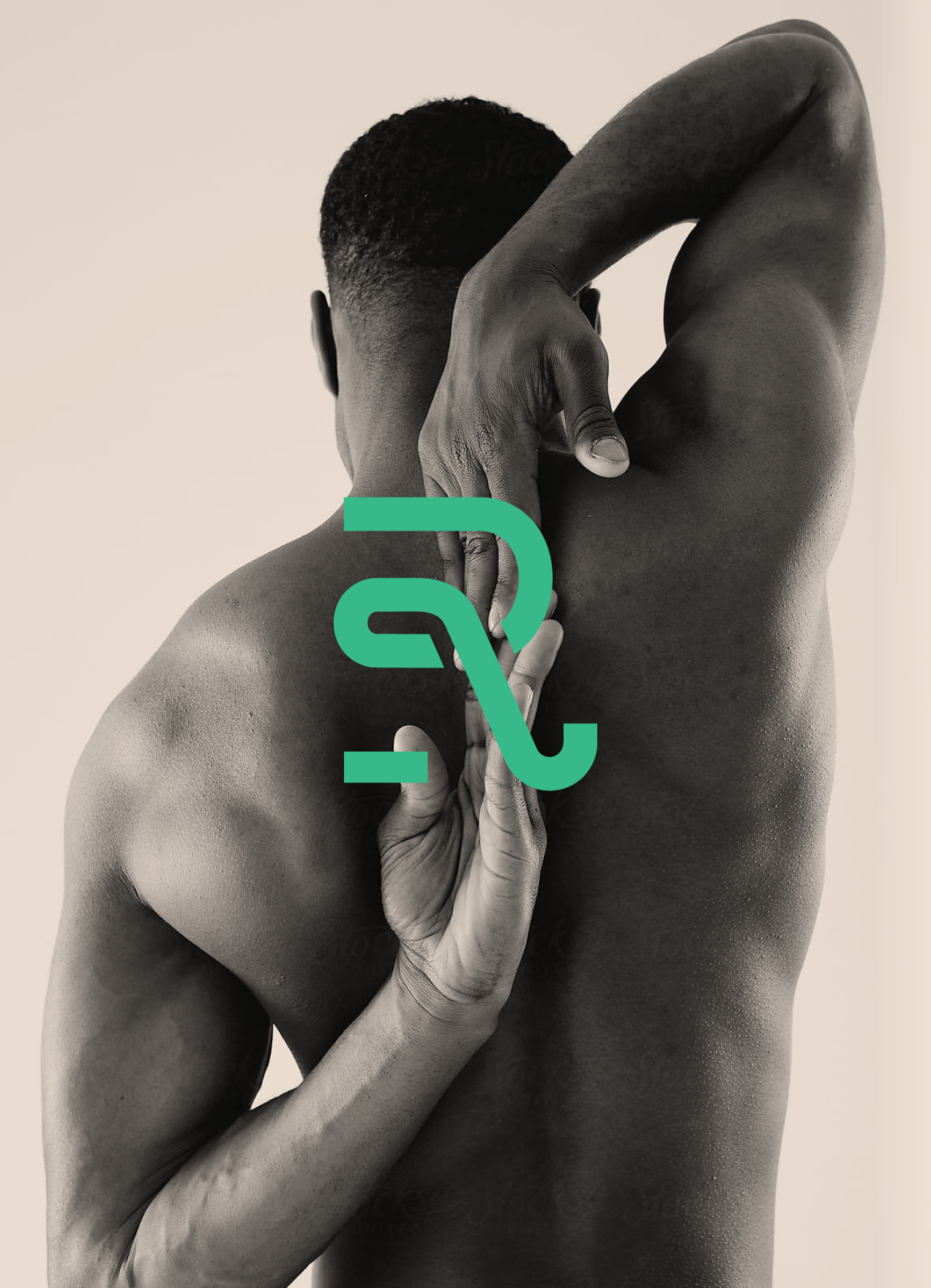
RecoverieVisual Identity
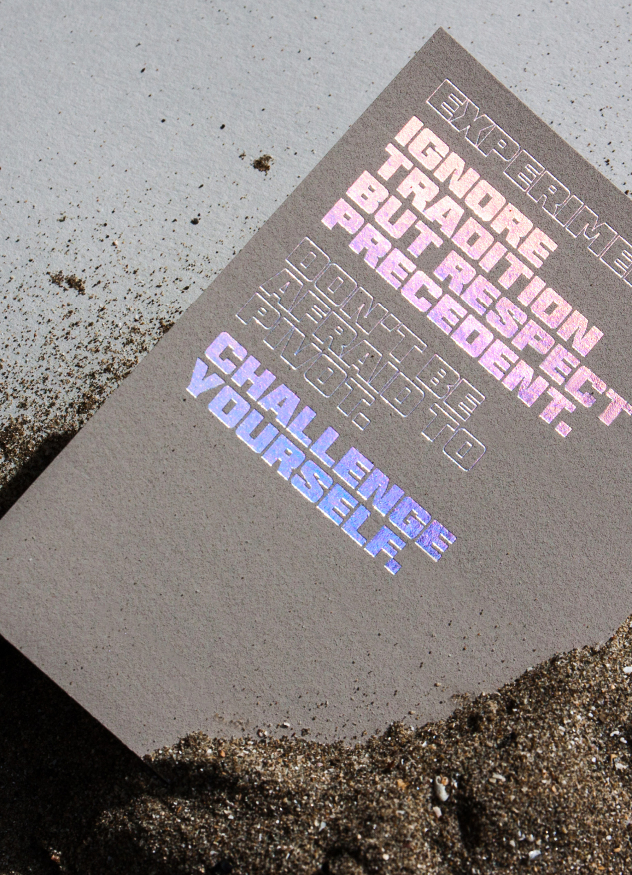
HHHI,Visual Identity, Packaging Design, Print Design
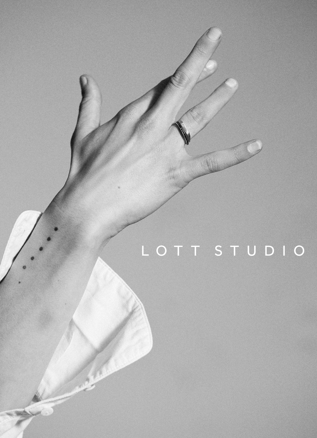
Lott StudioVisual Identity, Print Design
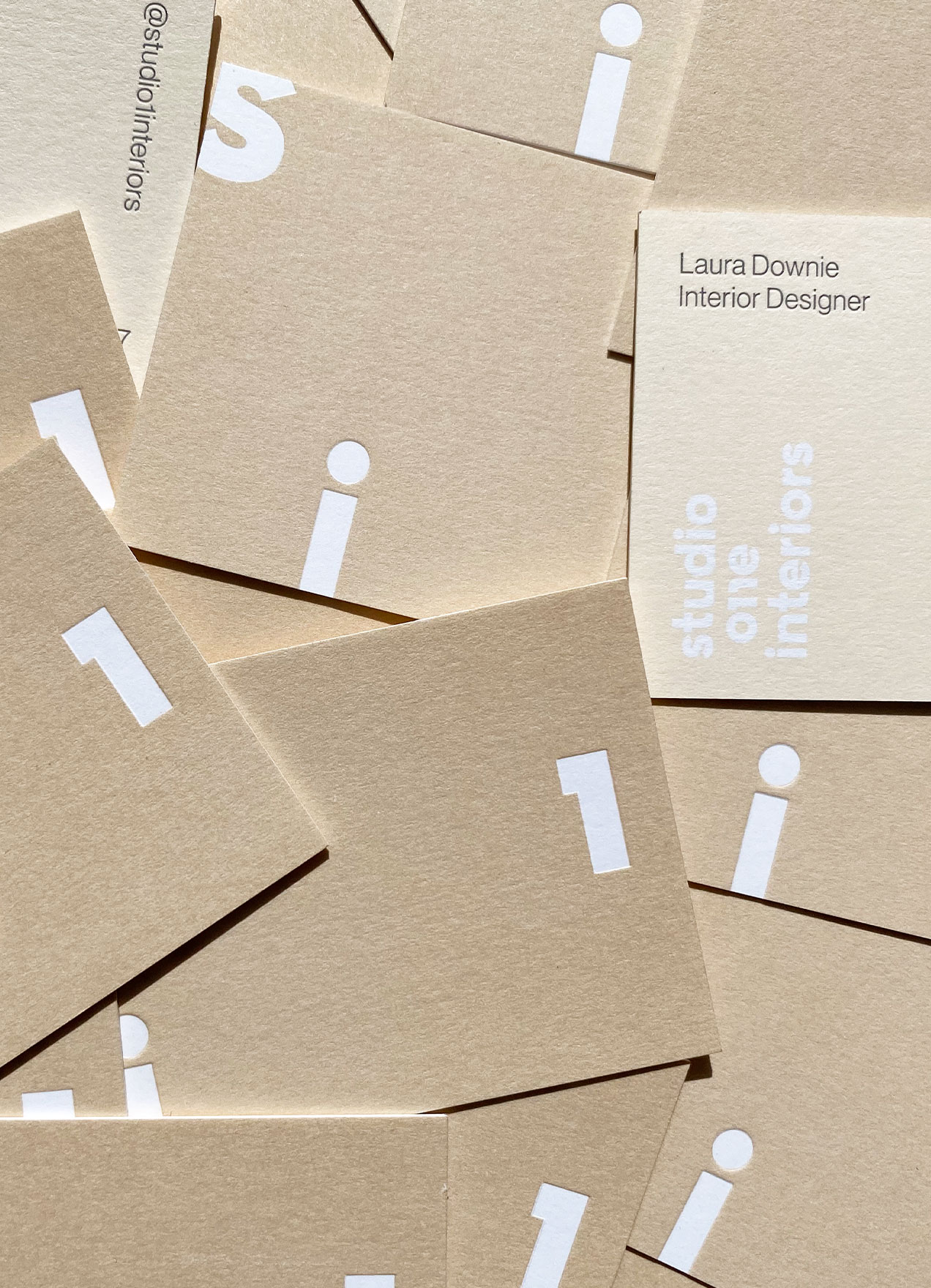
Studio 1 InteriorsVisual Identity, Print Design
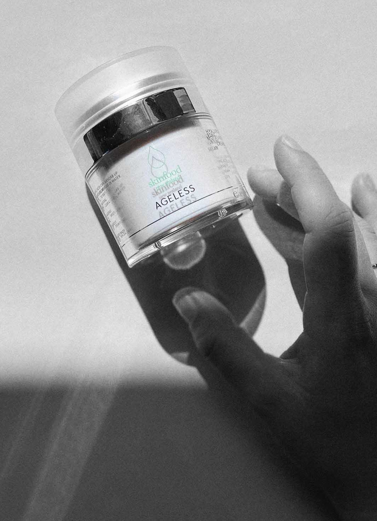
Skinfood AgelessVisual Identity, Packaging Design

Wedding StationeryCreative Direction, Print Design
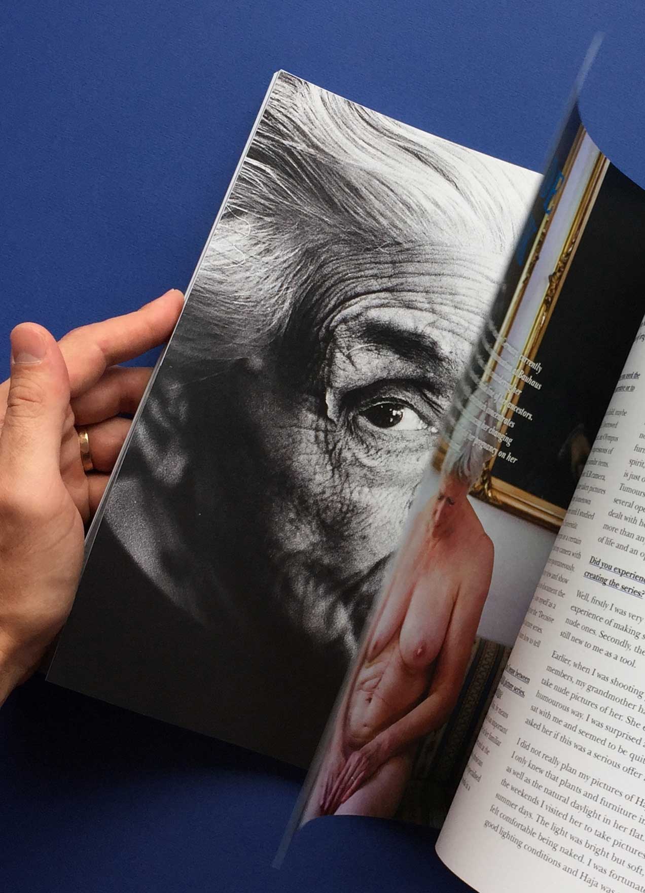
She Shoots FilmVisual Identity, Editorial Design
ArgoNaming, Visual Identity, Print Design
DesigntreeNaming, Visual Identity, Print Design

Chapter HouseVisual Identity, Print Design
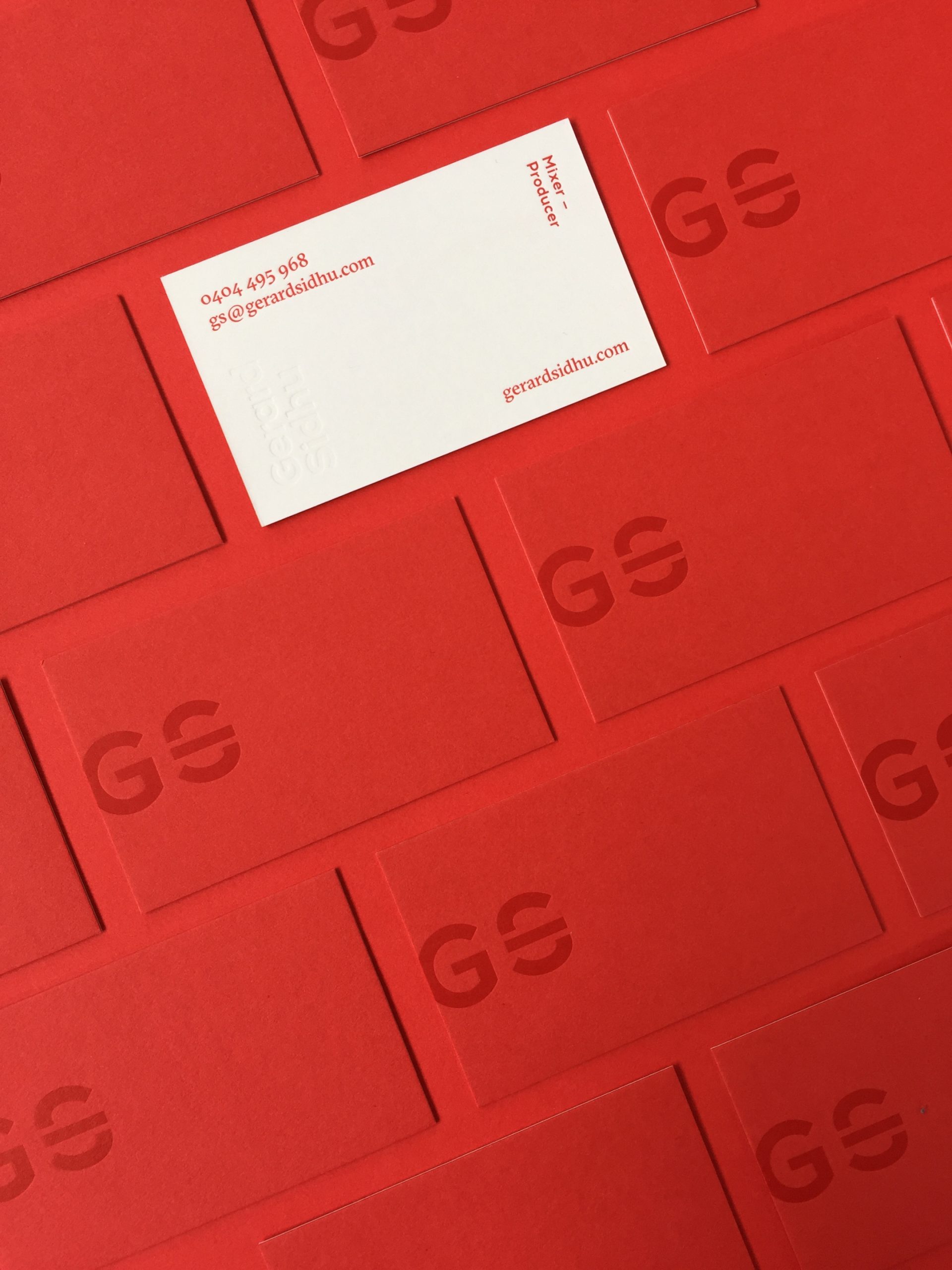
Gerard SidhuVisual Identity, Print Design
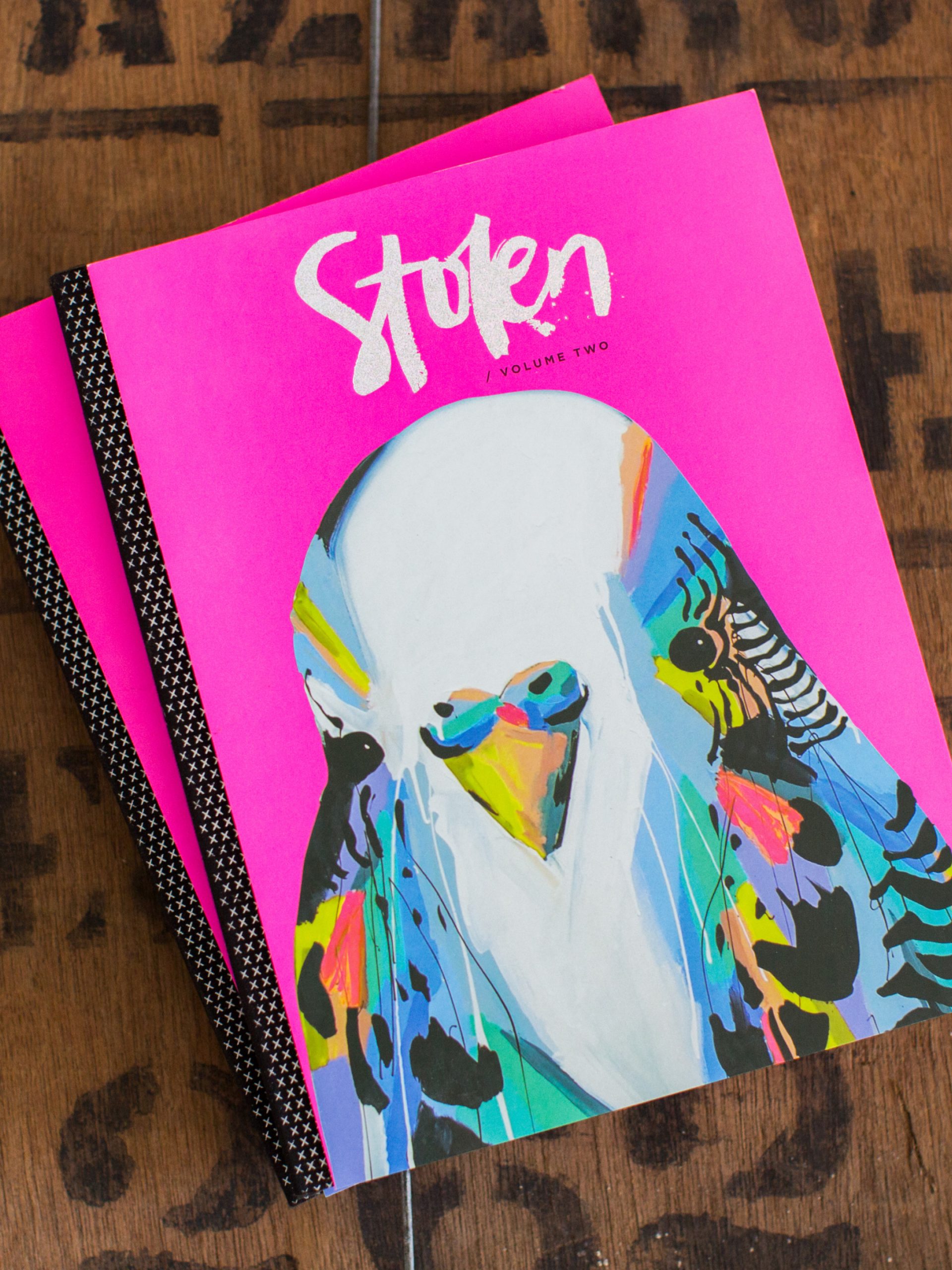
Stolen PublicationsCreative Direction, Visual Identity, Editorial Design