Client. She Shoots Film
Services. Visual Identity, Editorial Design
Editor-in-Chief. Aliki Smith
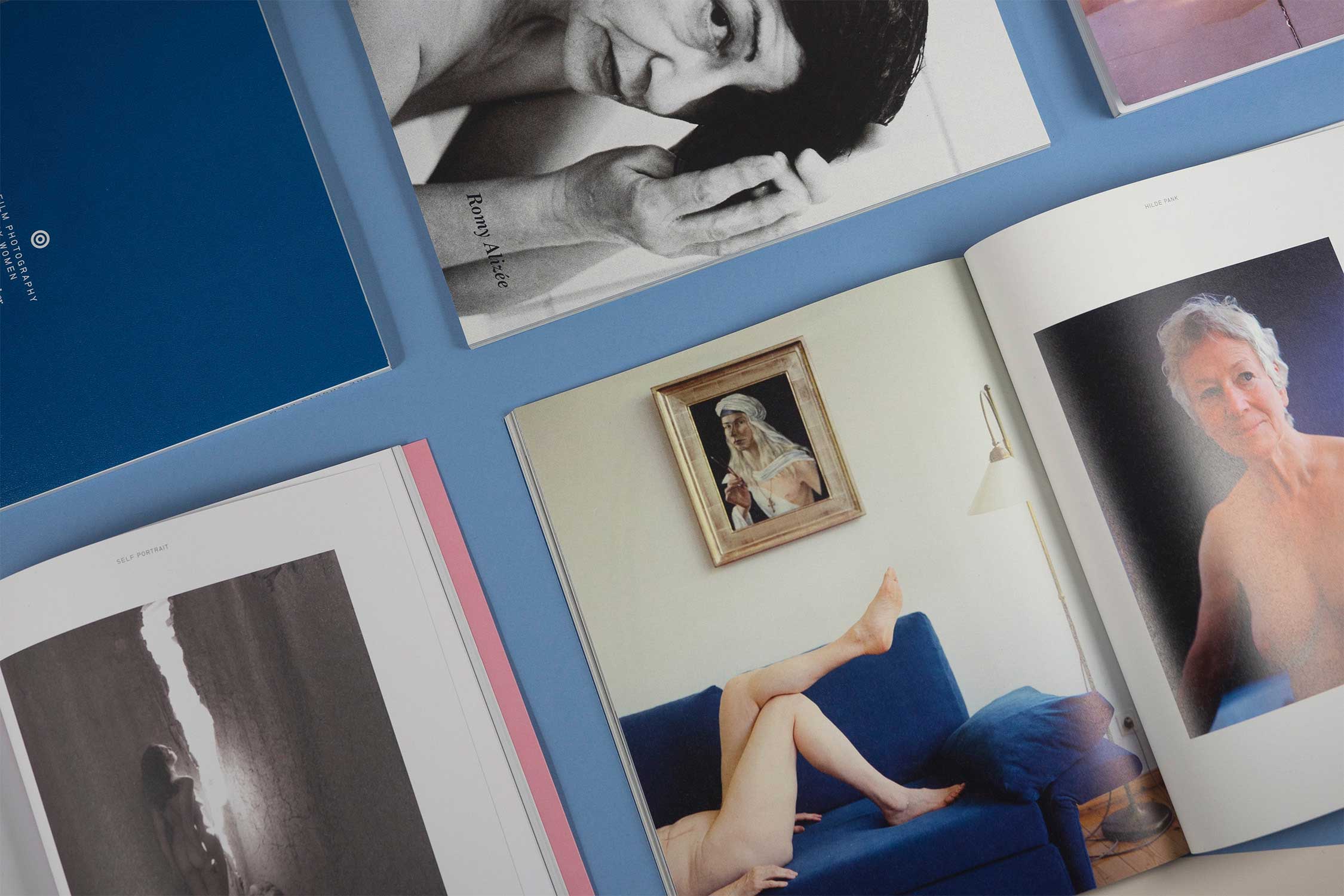
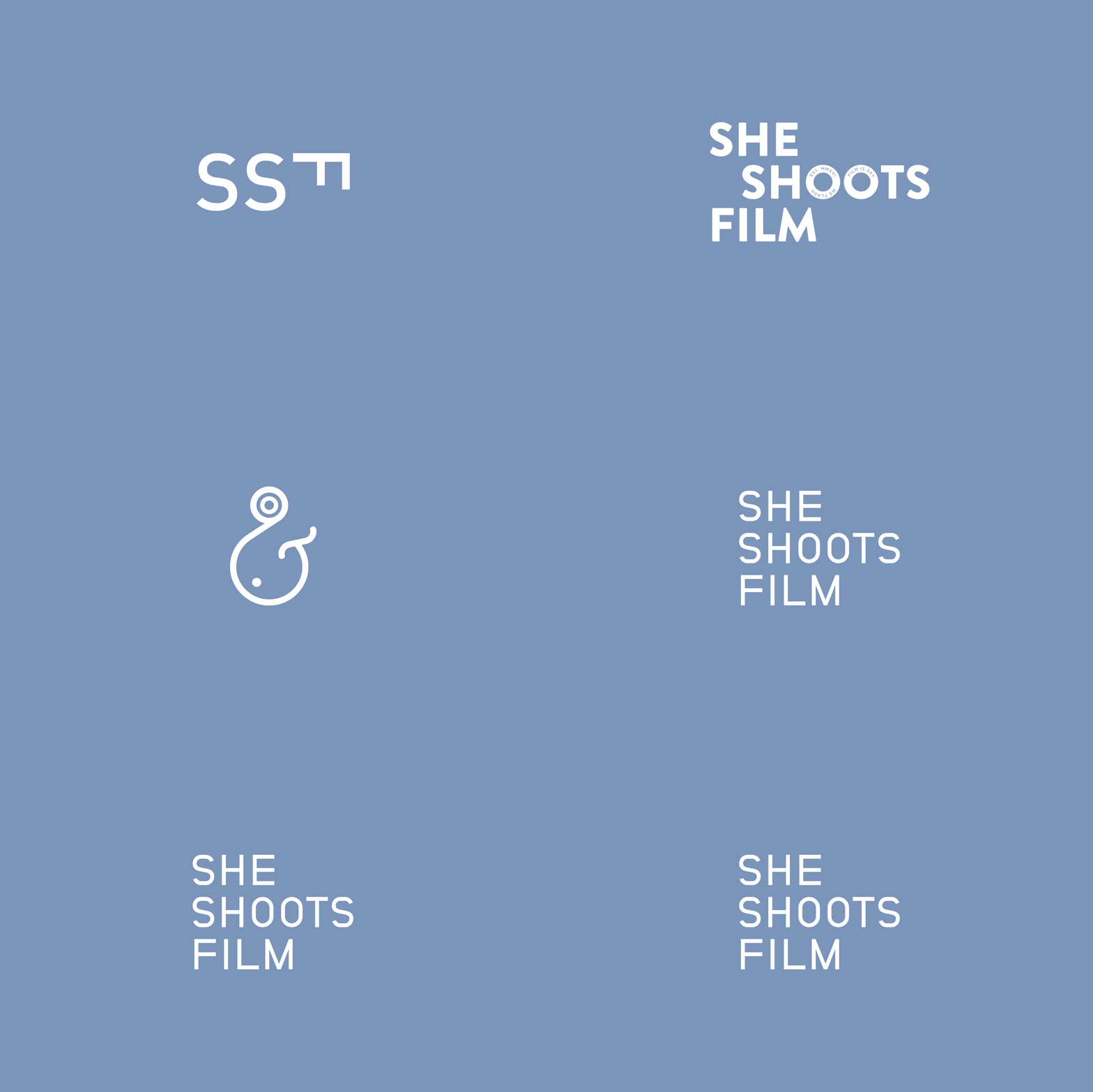
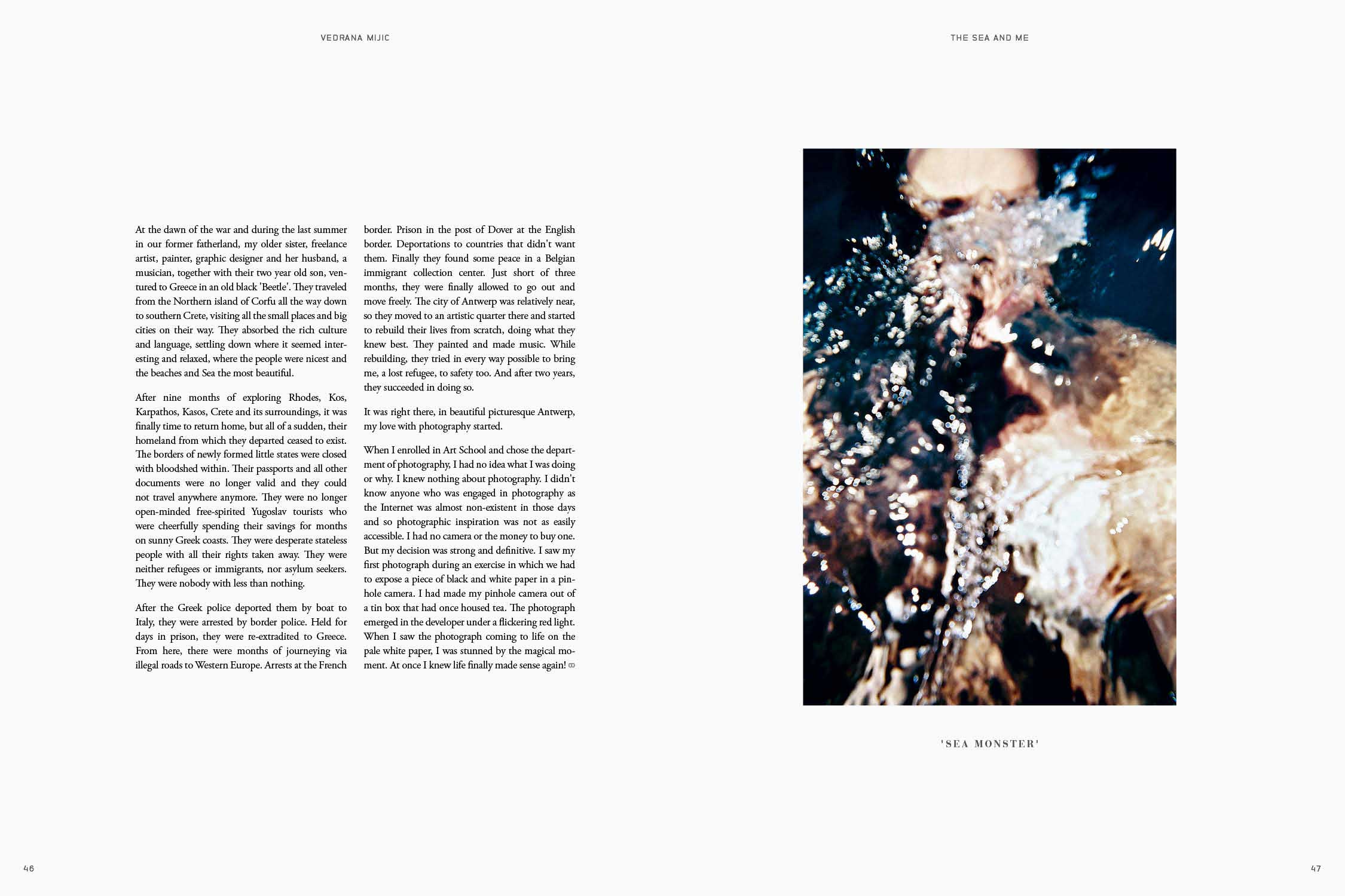
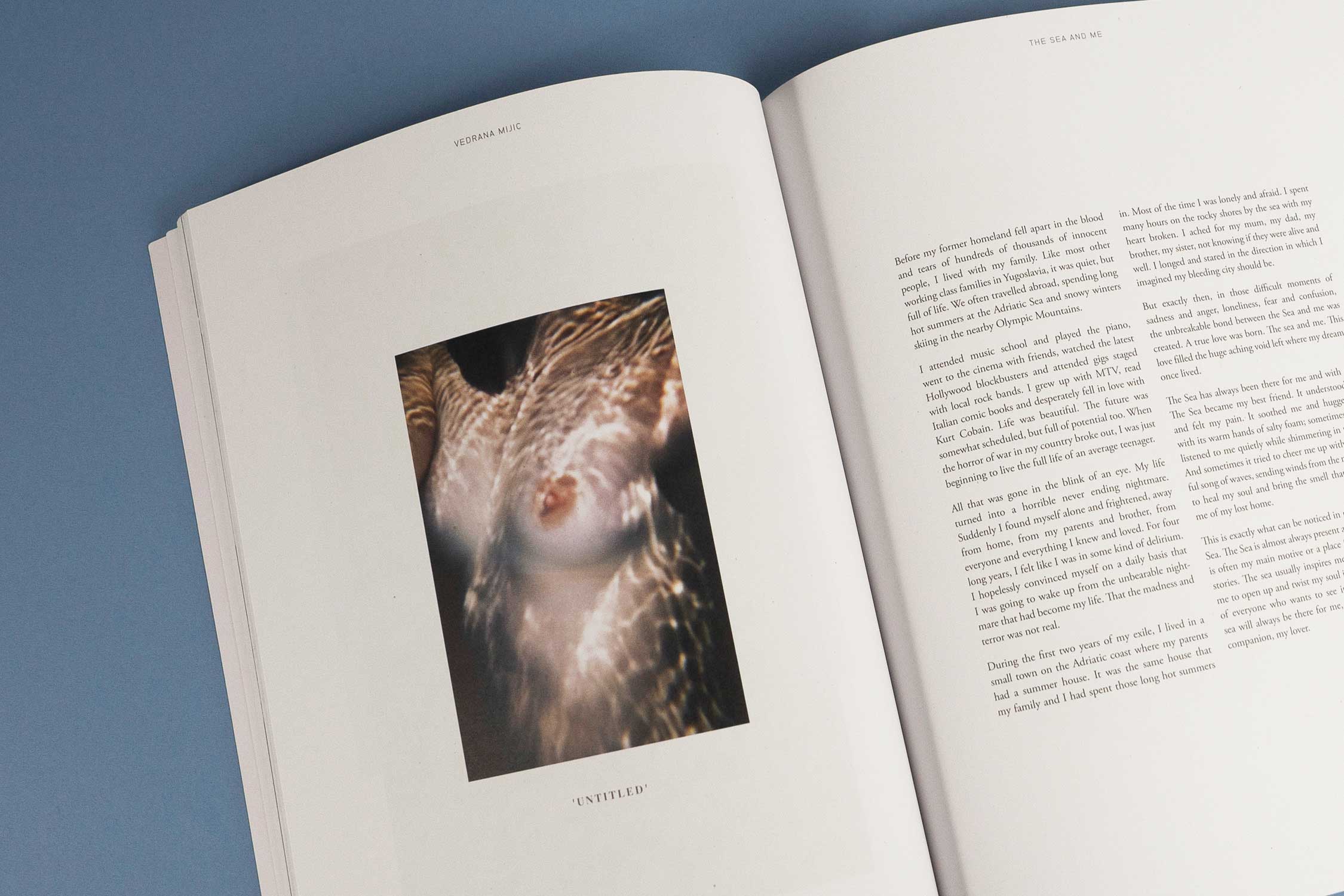
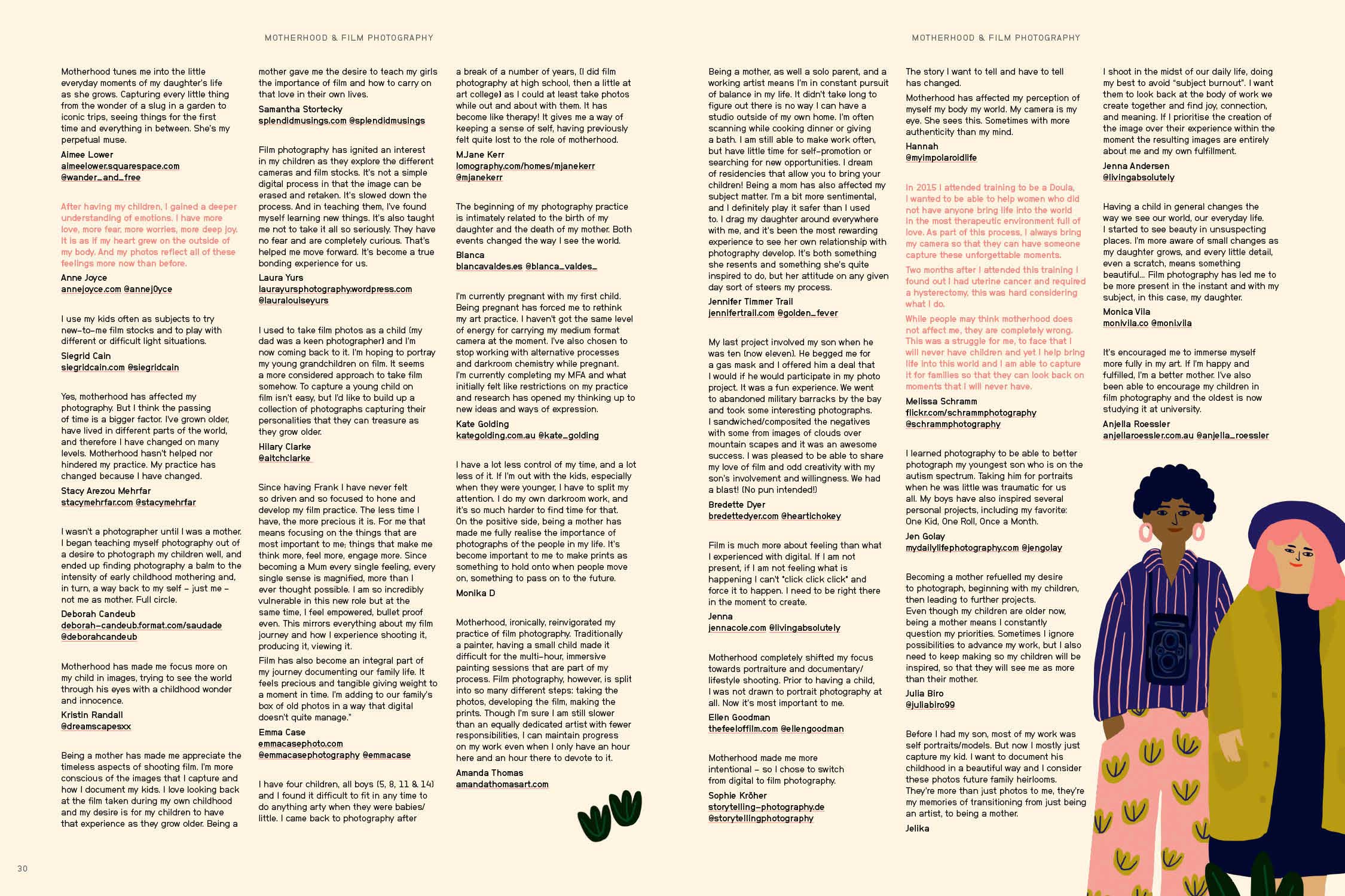
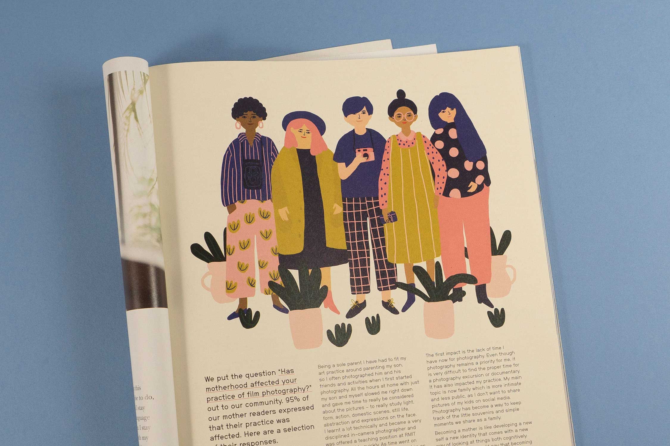
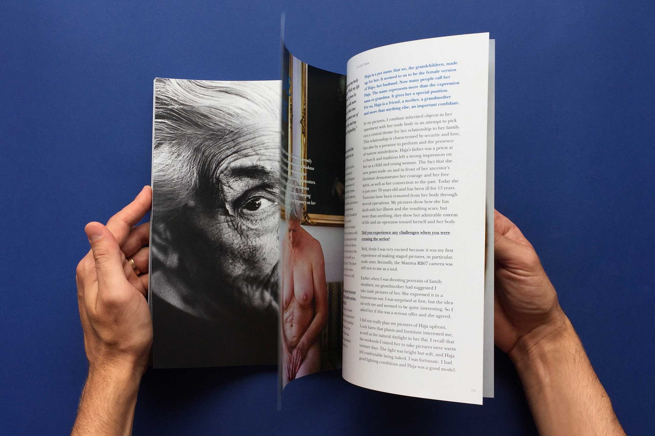
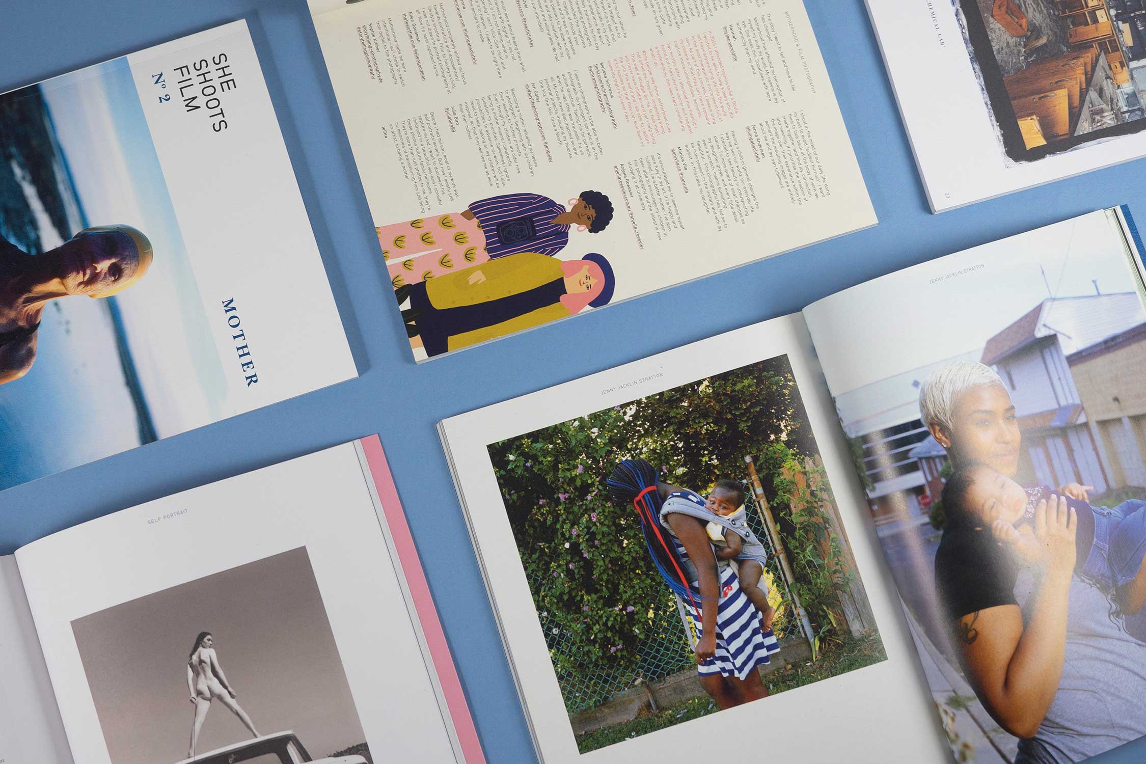
After two years as a film photography blog She Shoots Film sought a visual identity to support their transition into a bi-annual publication. To represent a brand dedicated to exploring life through the female gaze, multiple themes were explored – femininity, film photography and minimalism.
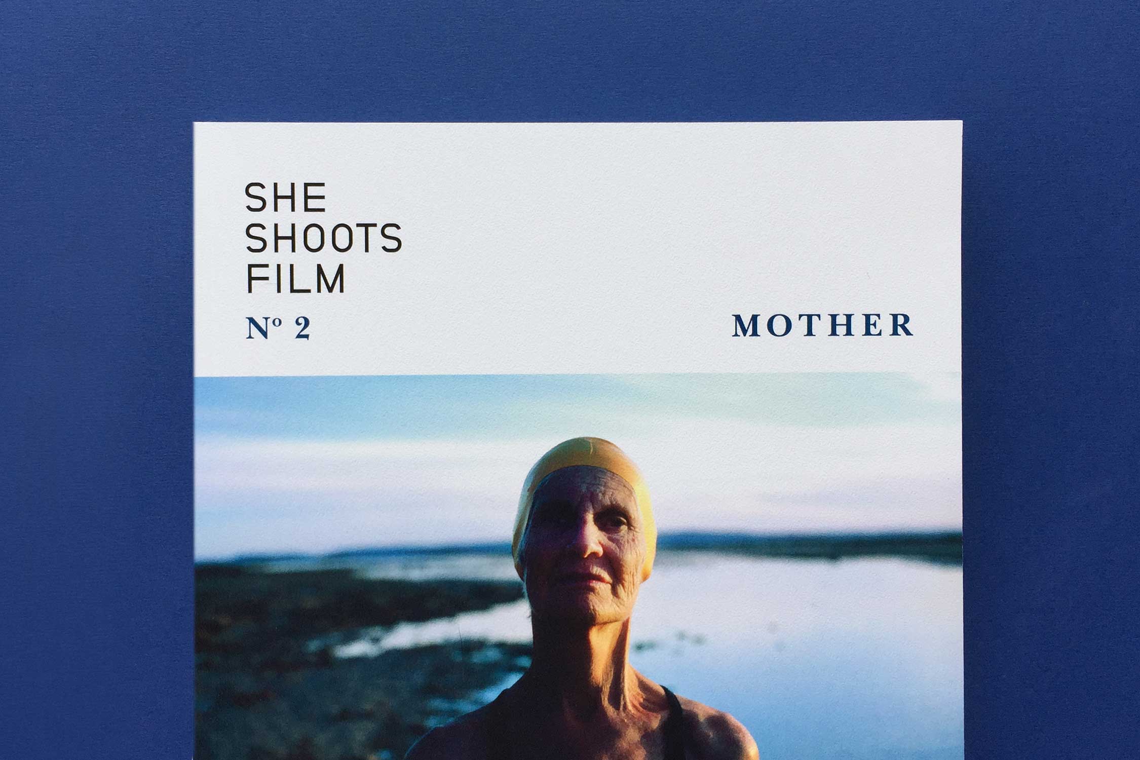
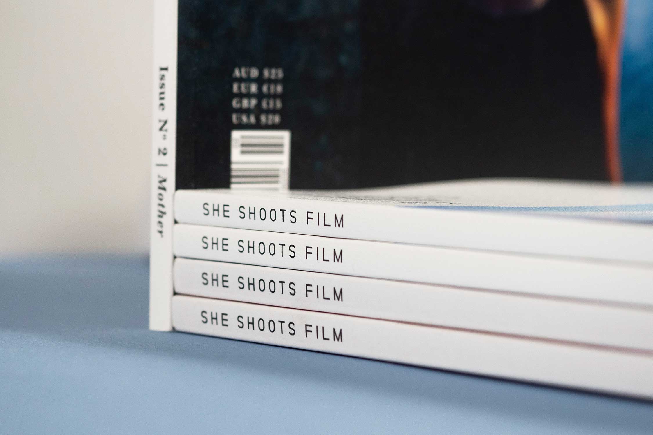
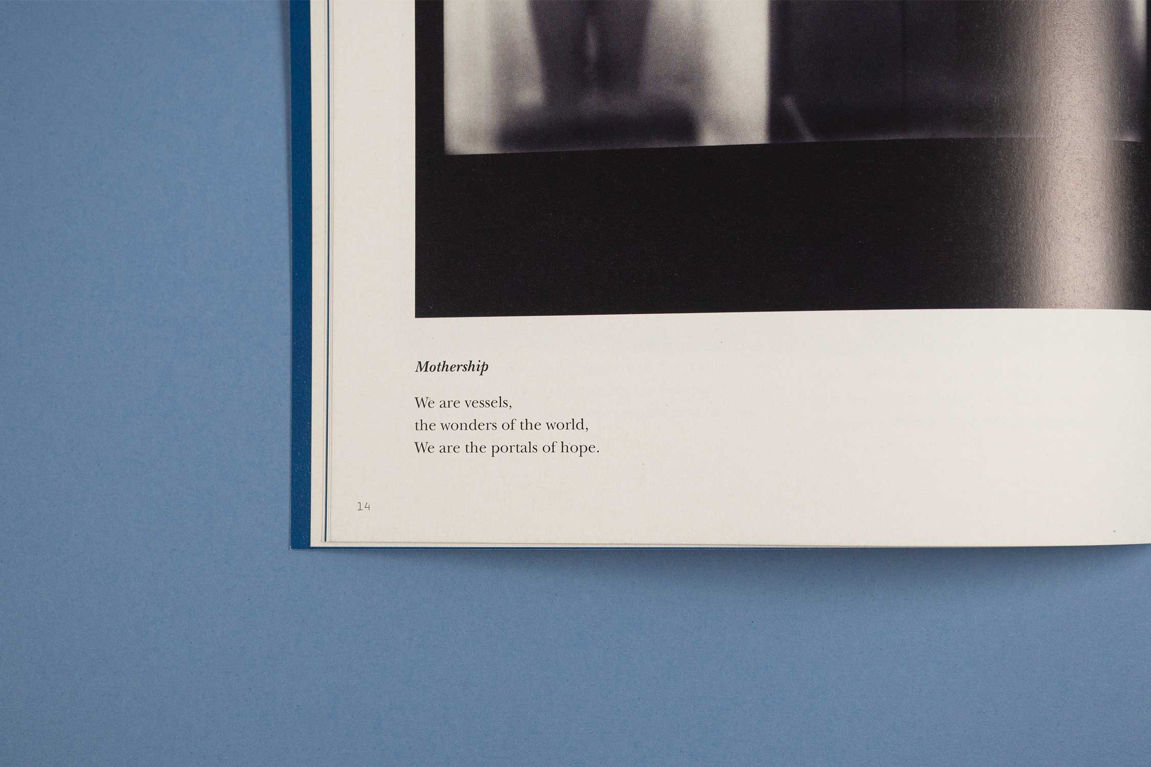
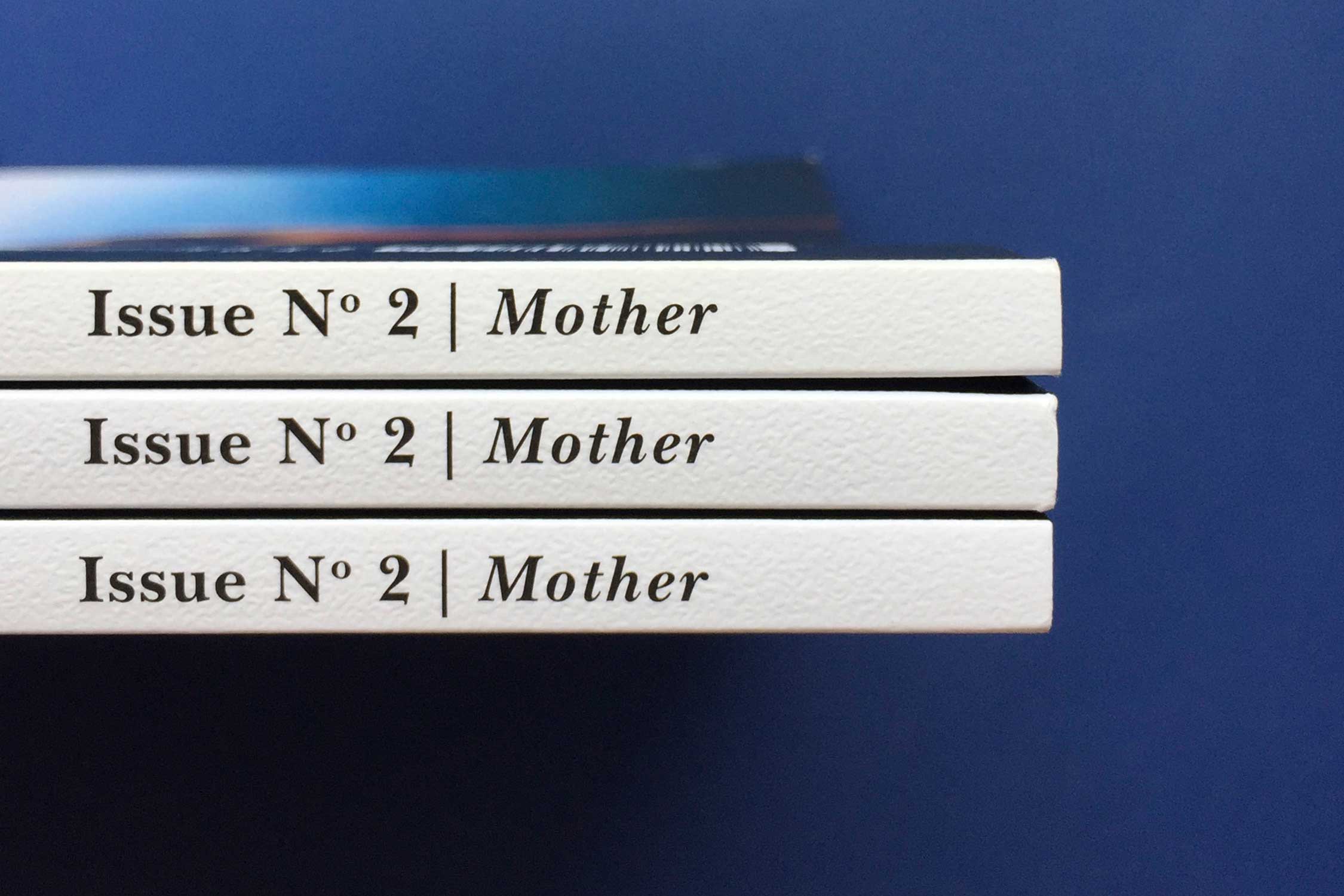
When establishing the visual identity system for the publication, a solution was developed that could be executed as both a masthead for the publication and a brandmark for all other executions. Opportunities to support the user in navigating key elements of the publication were also explored and developed. On the cover, simplified colours reflective of the artist’s work helps identify each issue and is constantly changing to allow for flexibility. Subtle typography changes using a narrowed type palette for cohesiveness help to differentiate sections in each publication.
SELECTED PROJECTS
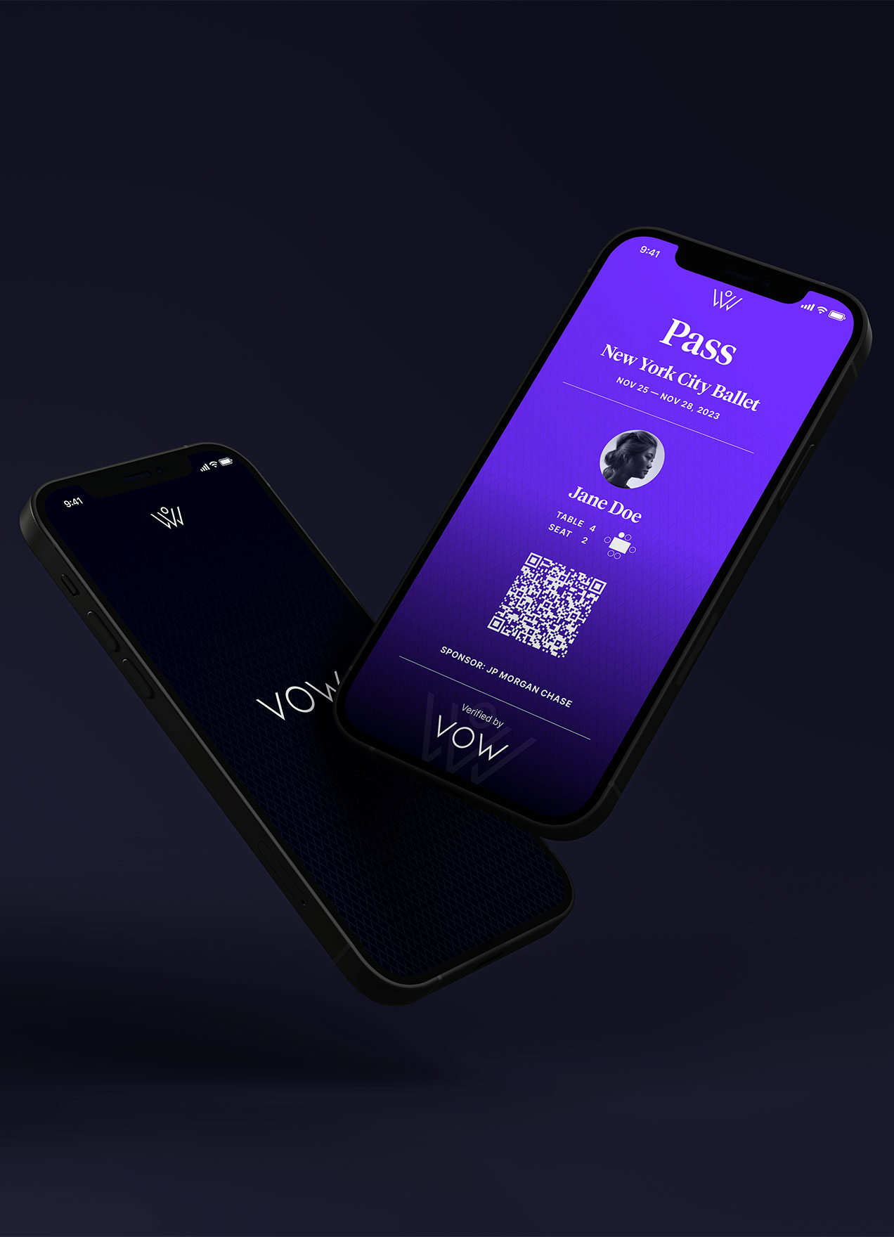
VOWVisual Identity
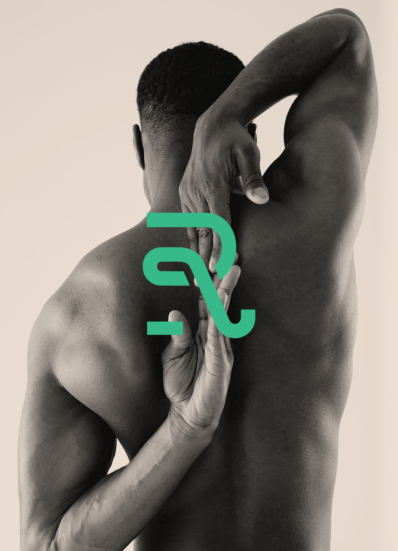
RecoverieVisual Identity
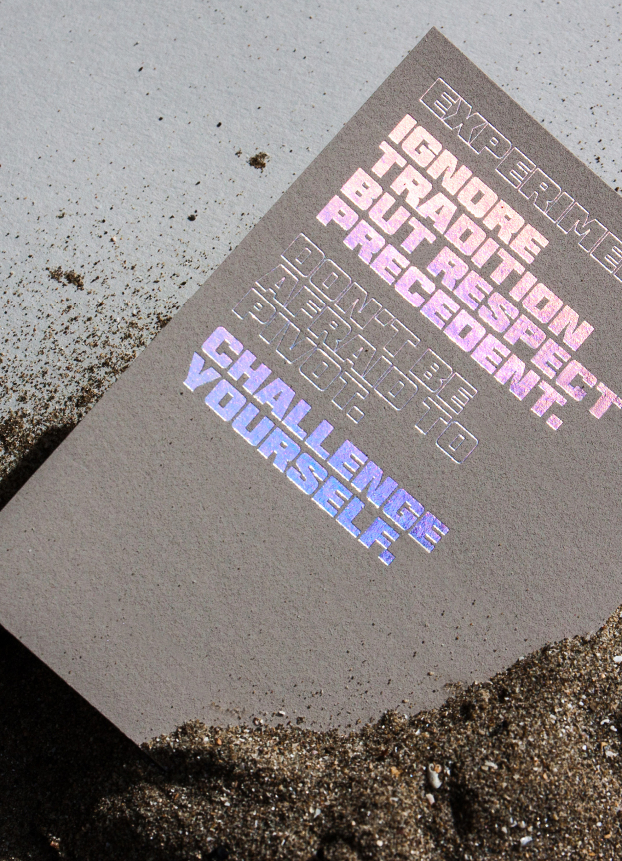
HHHI,Visual Identity, Packaging Design, Print Design
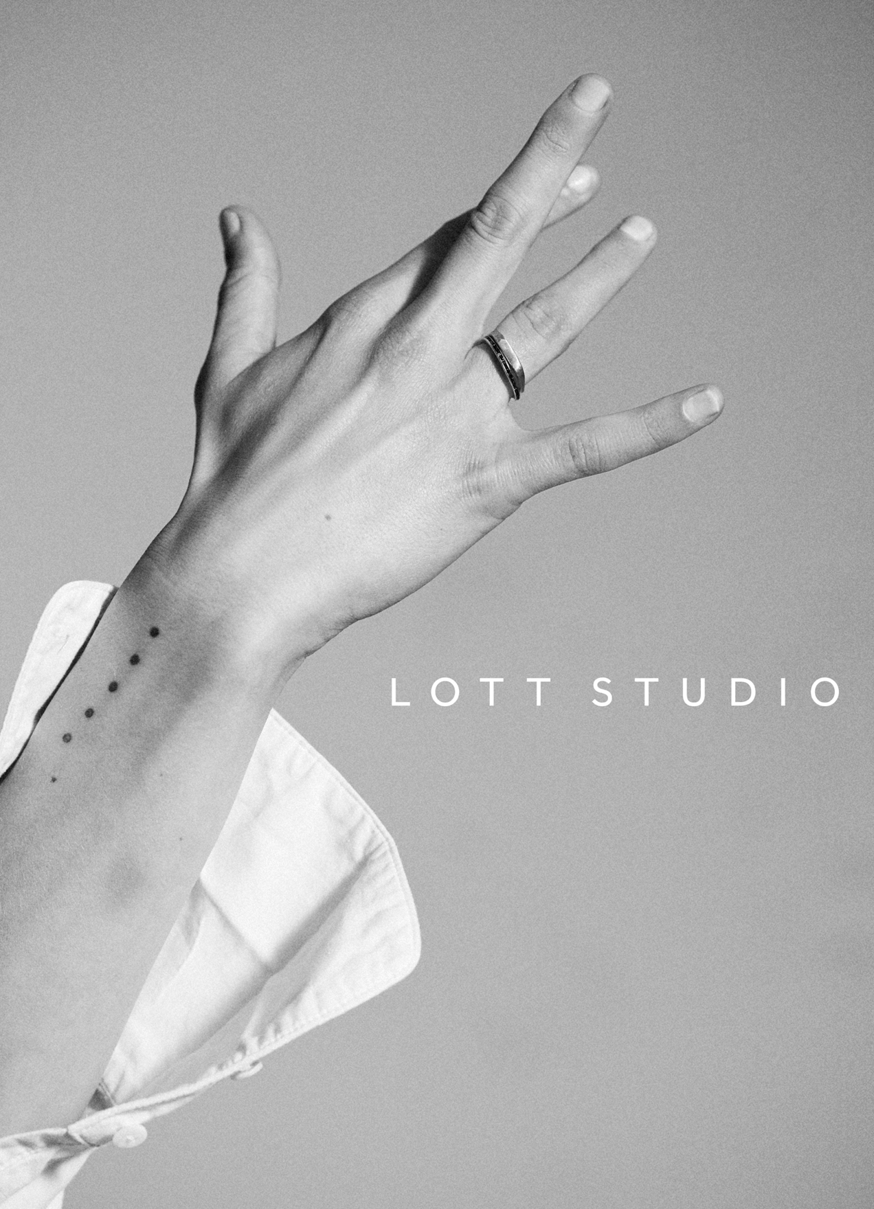
Lott StudioVisual Identity, Print Design
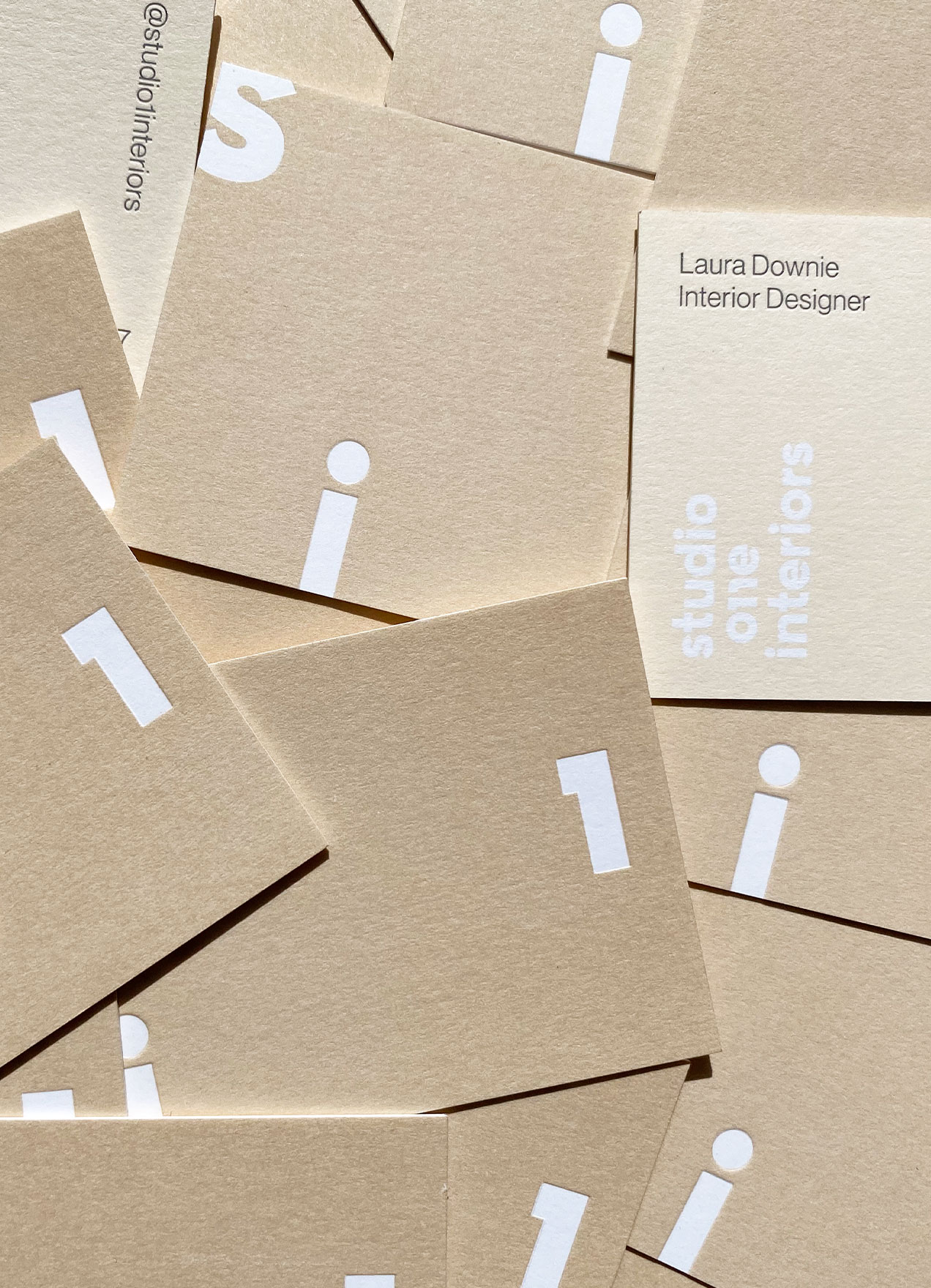
Studio 1 InteriorsVisual Identity, Print Design

Skinfood AgelessVisual Identity, Packaging Design

Wedding StationeryCreative Direction, Print Design

ArgoNaming, Visual Identity, Print Design

DesigntreeNaming, Visual Identity, Print Design

MerineoNaming, Visual Identity, Print Design

Chapter HouseVisual Identity, Print Design
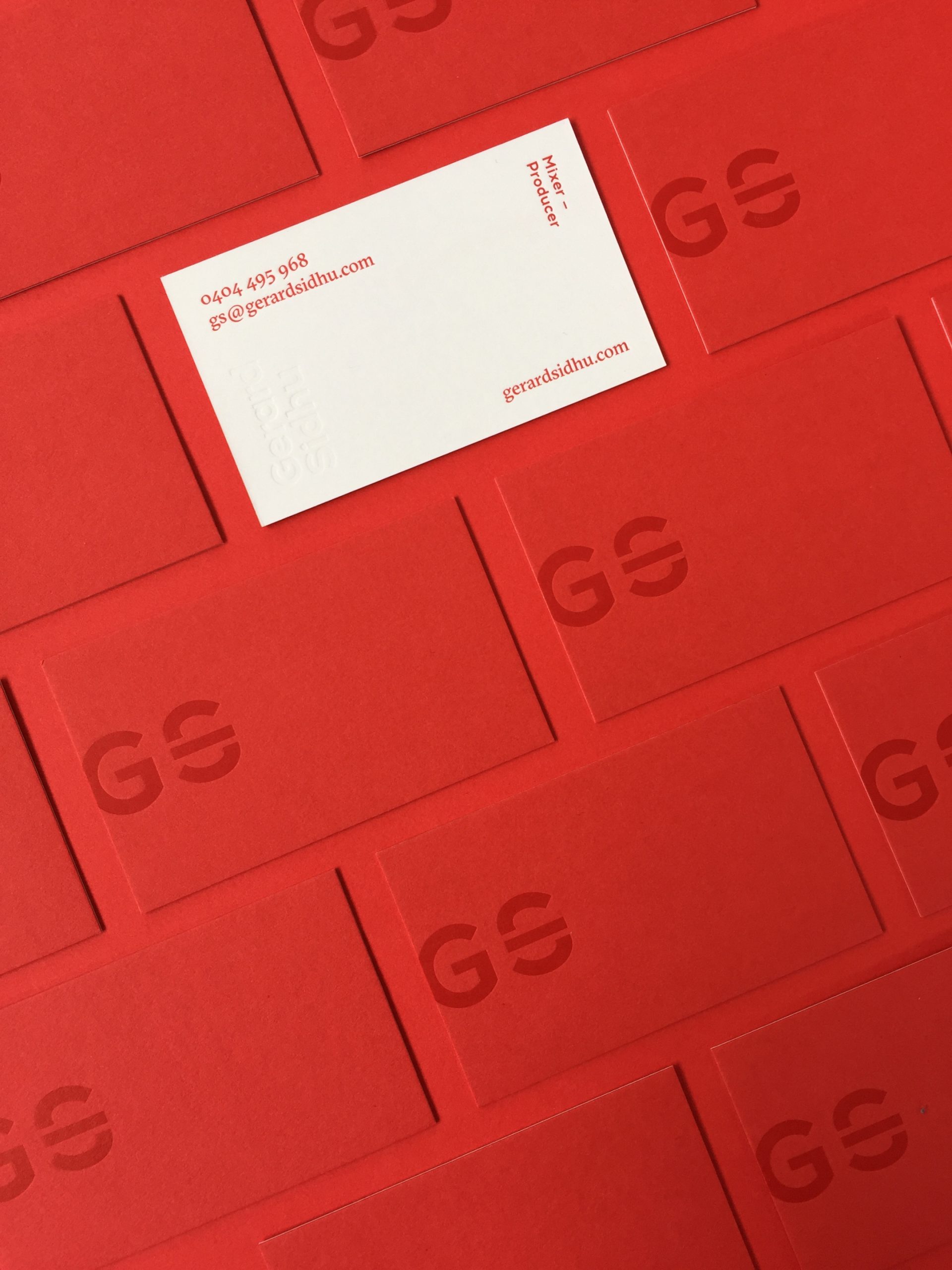
Gerard SidhuVisual Identity, Print Design
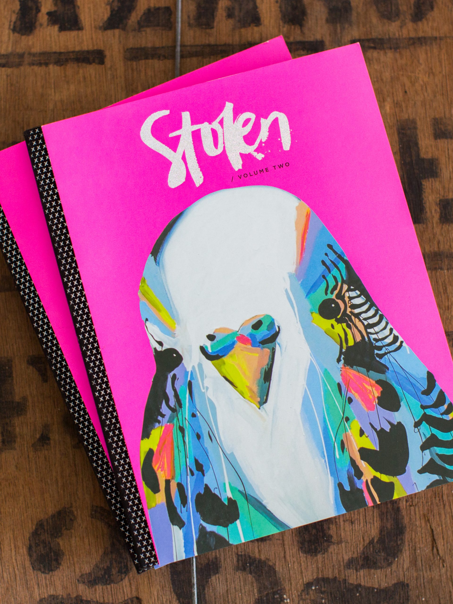
Stolen PublicationsCreative Direction, Visual Identity, Editorial Design