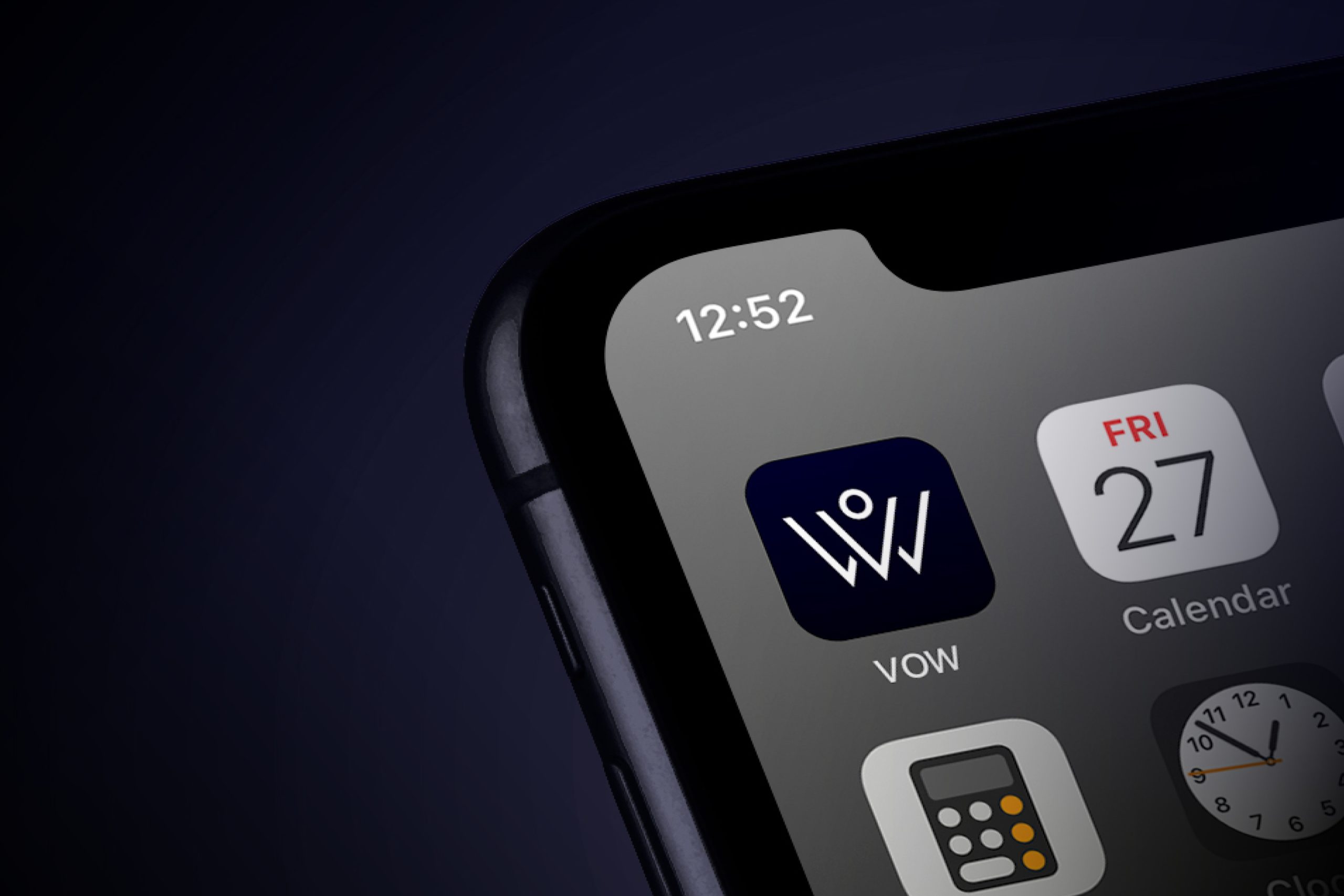
Client. VOW
Services. Visual Identity & Concepts
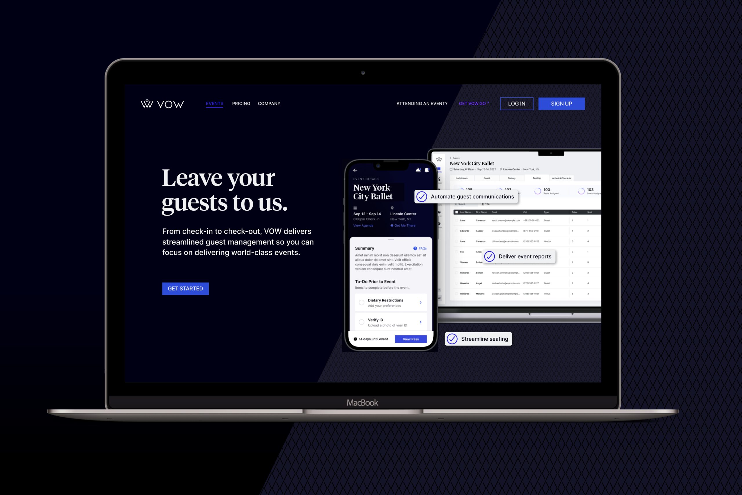
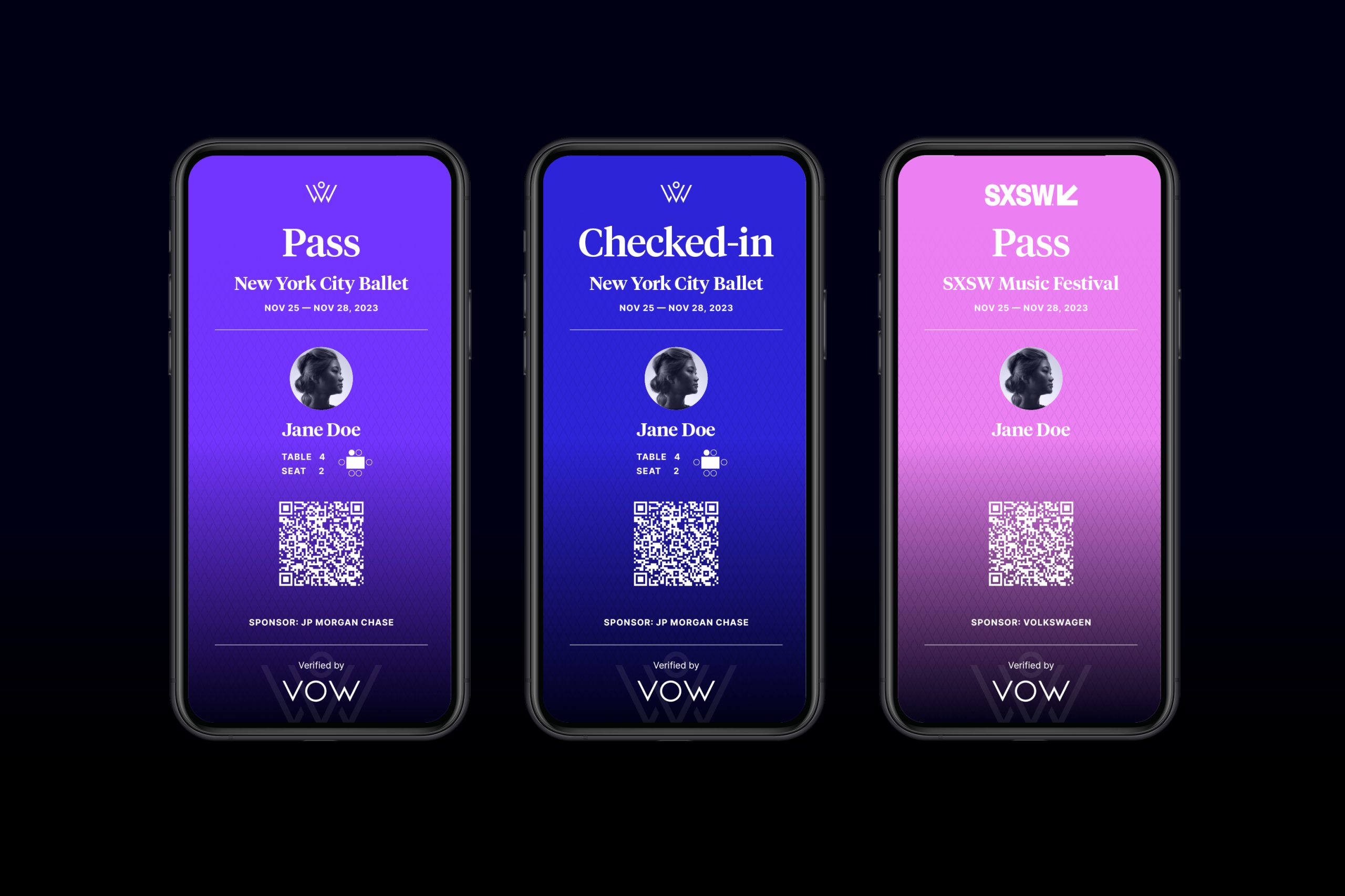
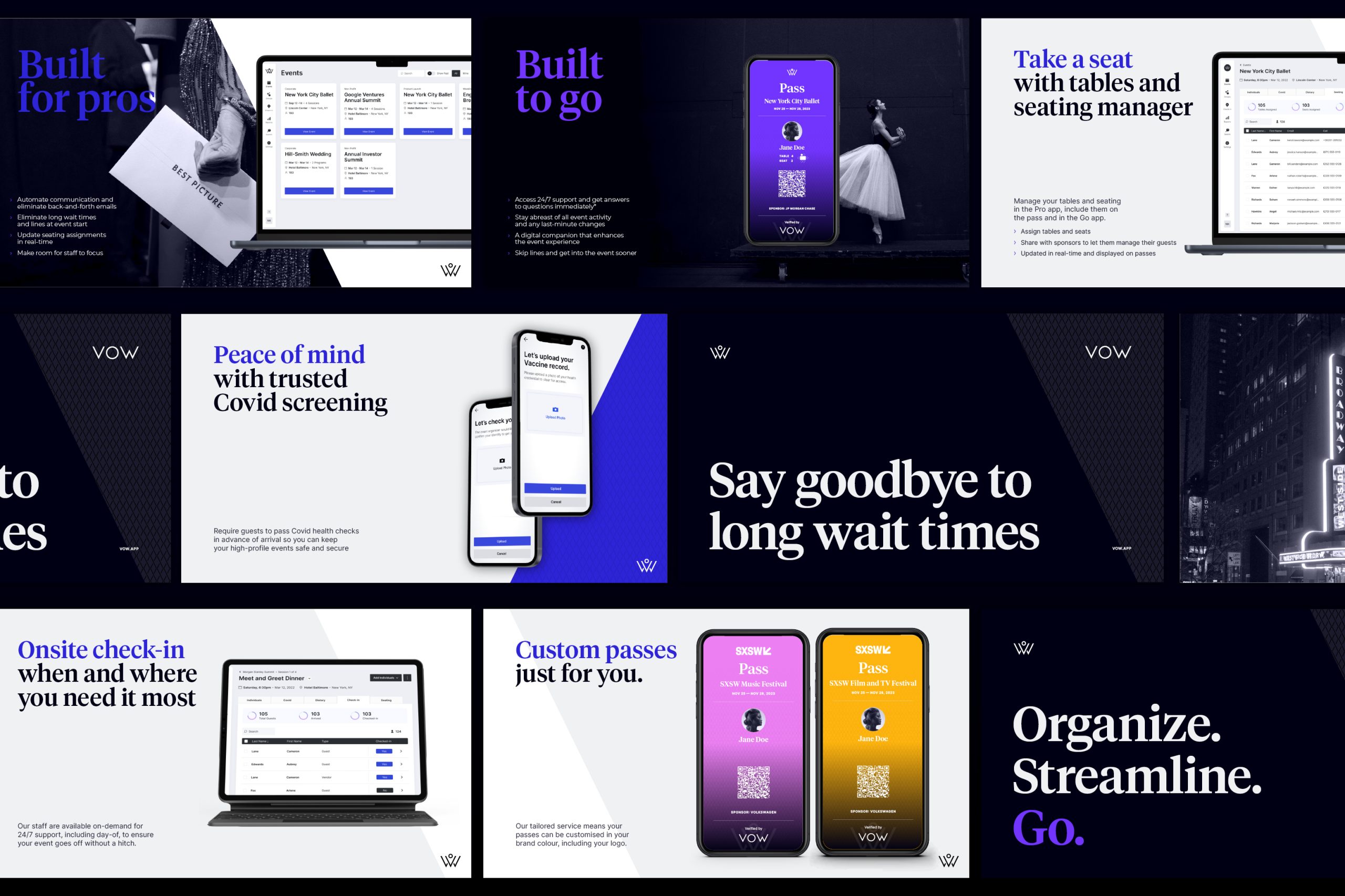
VOW's primary focus is on ensuring a memorable experience for your guests, allowing you to concentrate on your events. In response to the challenges posed by Covid, the company shifted its focus from being an all-in-one event management workspace to becoming a guest management app specifically designed for live events. VOW is purpose built for event organisers.
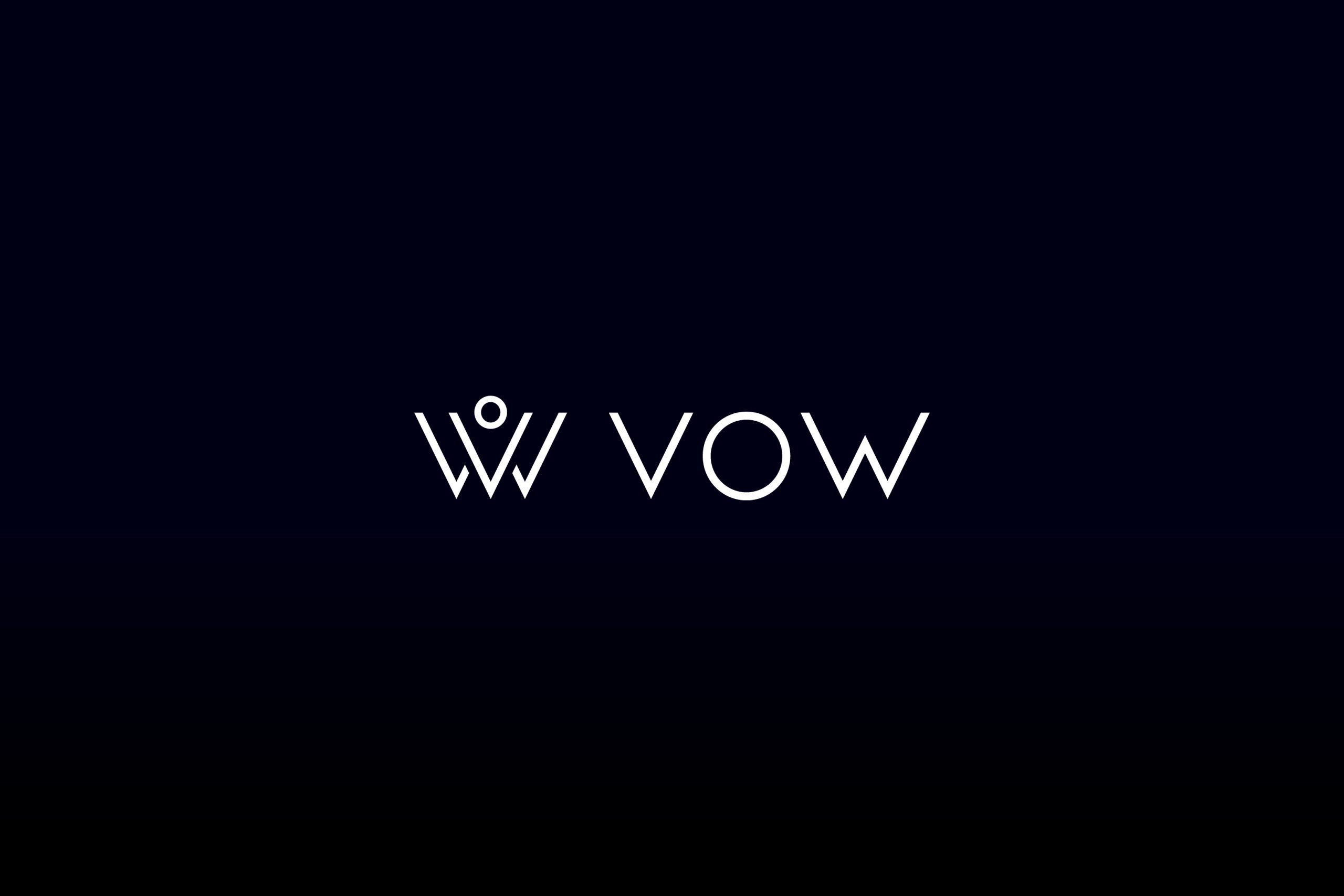
The original brandmark, derived from the founders' wedding planning company, has been transformed into a strong and recognisable symbol that aligns with the company's evolution towards delivering seamless world-class experiences.
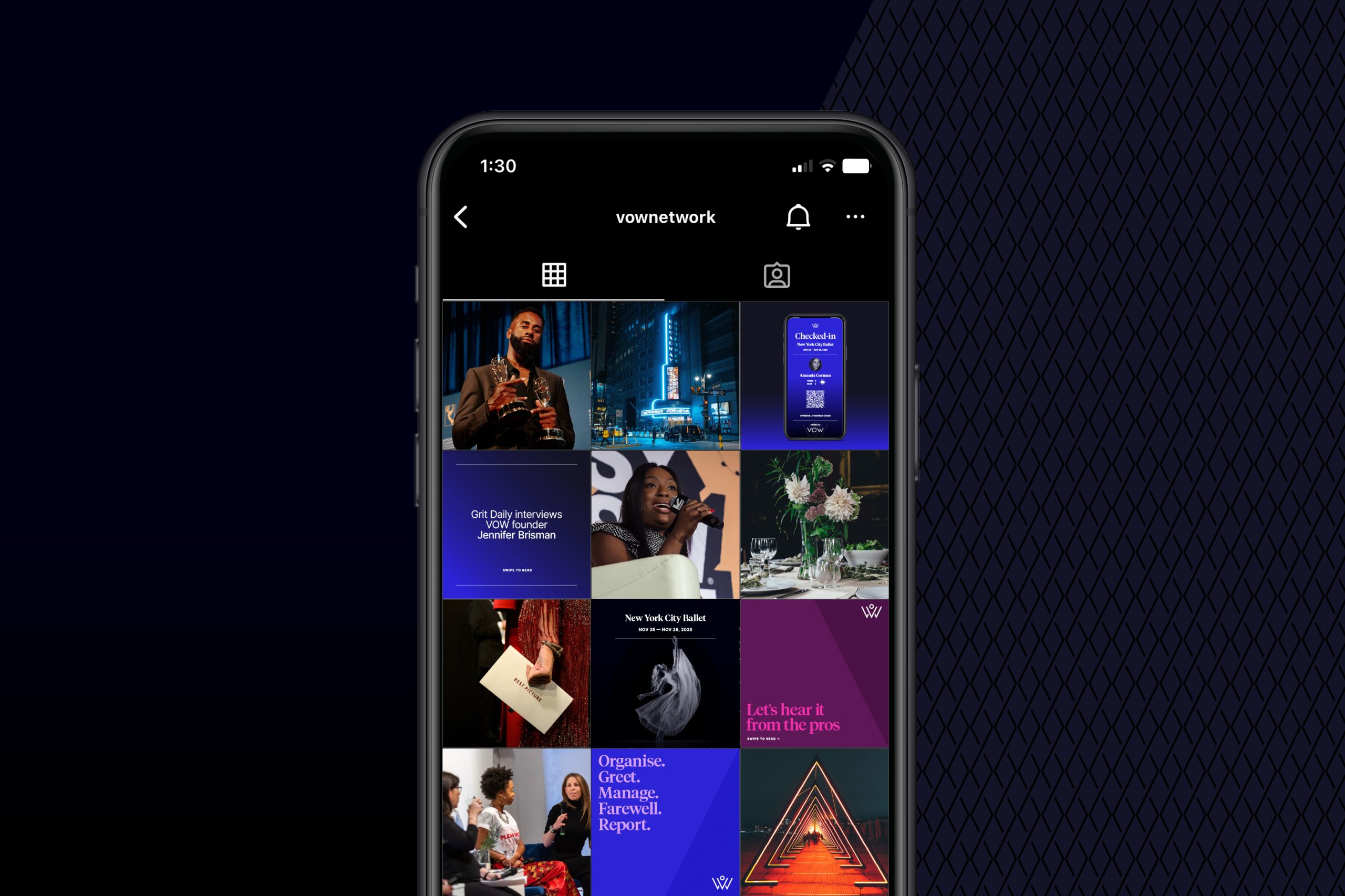
To enhance the existing wordmark, a comprehensive refresh was carried out. The incorporation of a serif font adds a distinctive touch to VOW as a SaaS company, helping it to stand out in a market that can lack differentiation. The core color palette is deep and rich, complemented by jewel-tones in the supporting palette, reminiscent of the elegance of a black-tie event.

SELECTED PROJECTS

RecoverieVisual Identity
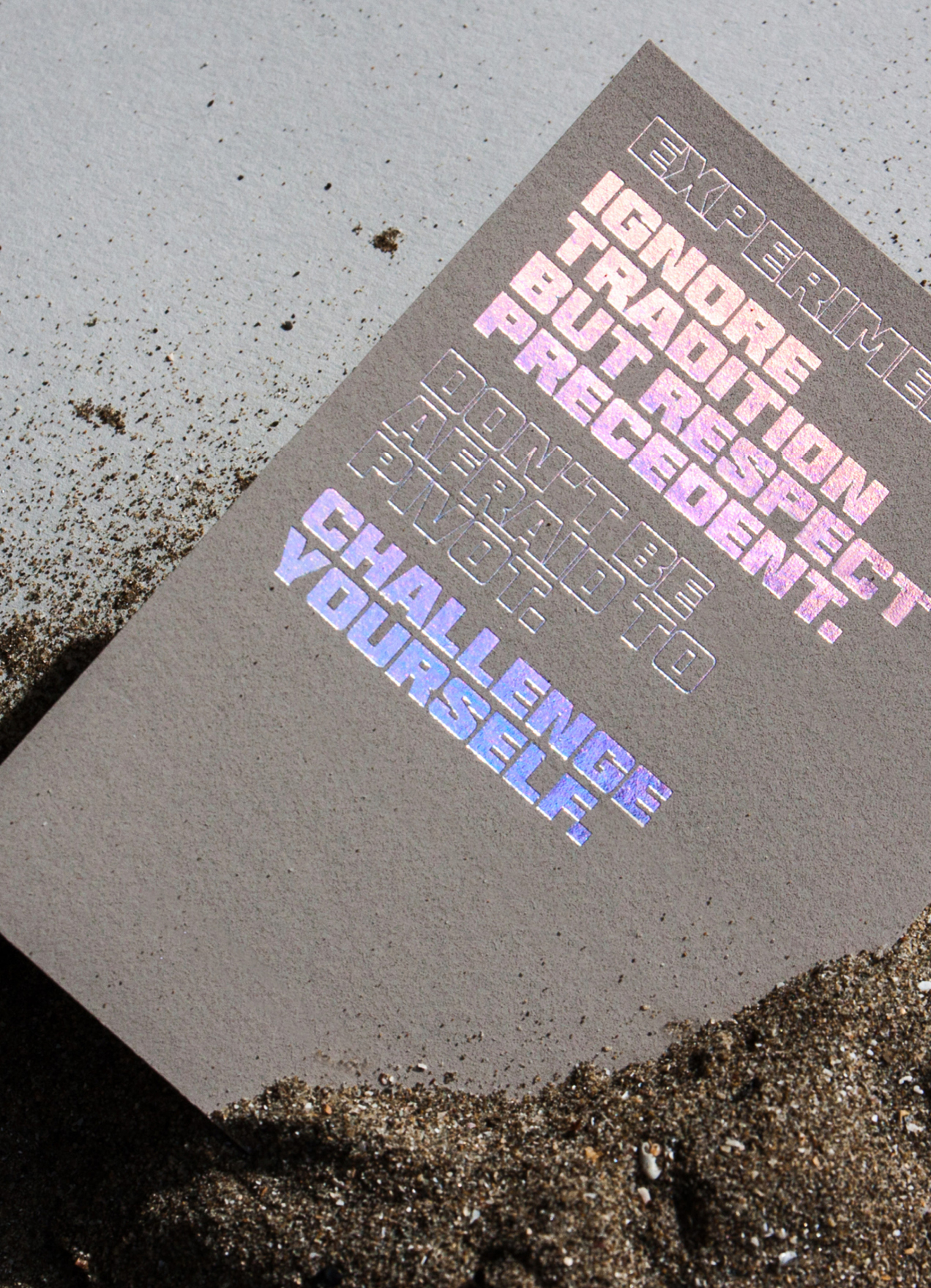
HHHI,Visual Identity, Packaging Design, Print Design
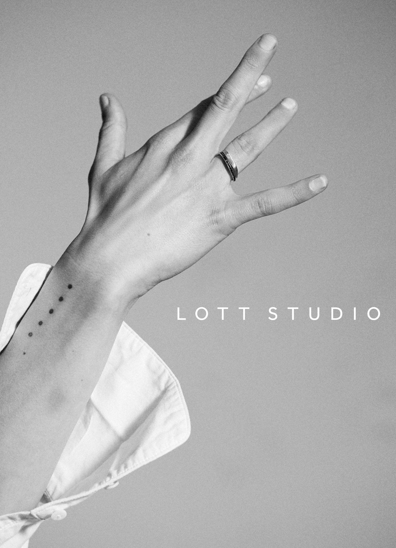
Lott StudioVisual Identity, Print Design
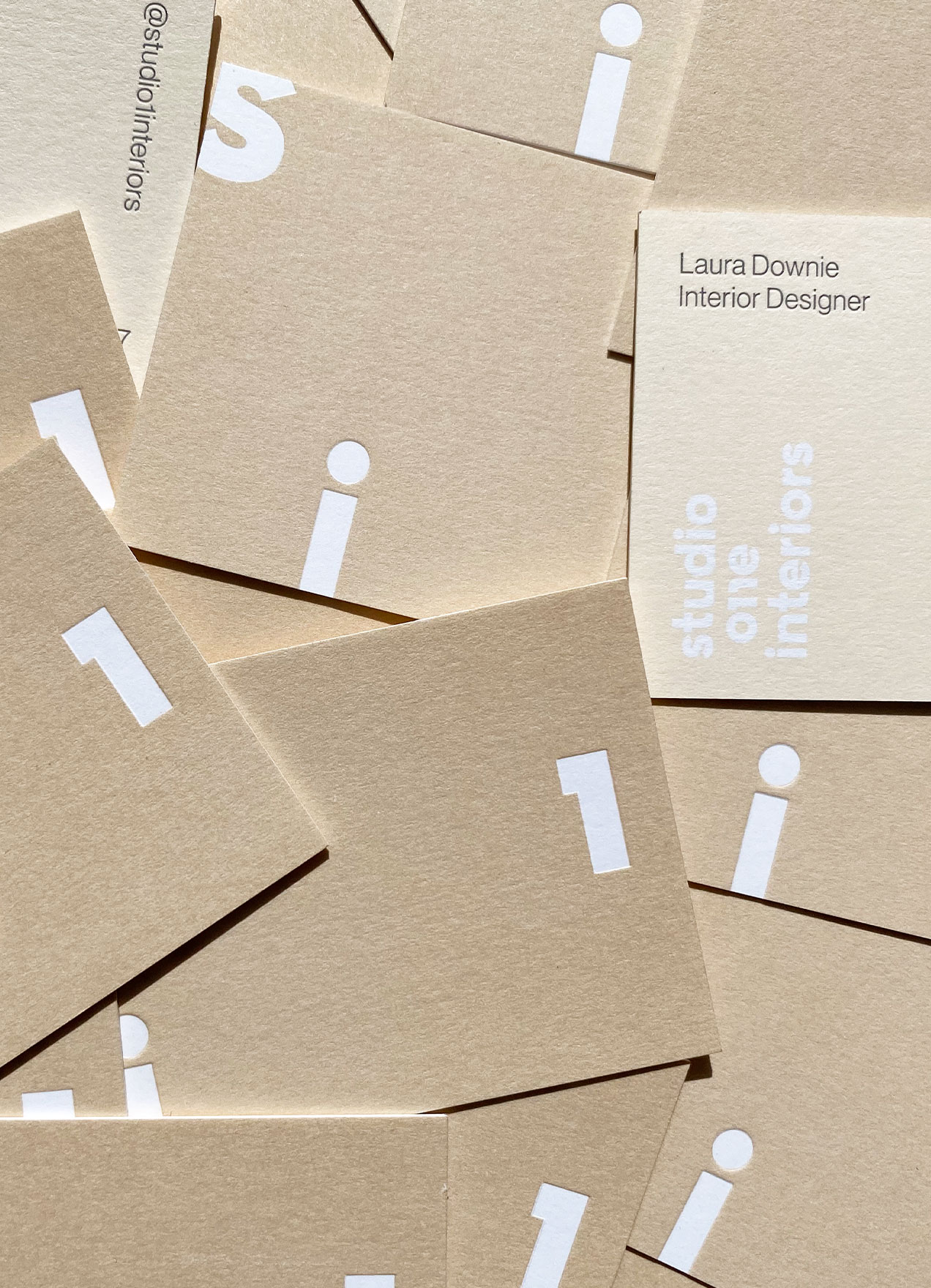
Studio 1 InteriorsVisual Identity, Print Design

Skinfood AgelessVisual Identity, Packaging Design

Wedding StationeryCreative Direction, Print Design
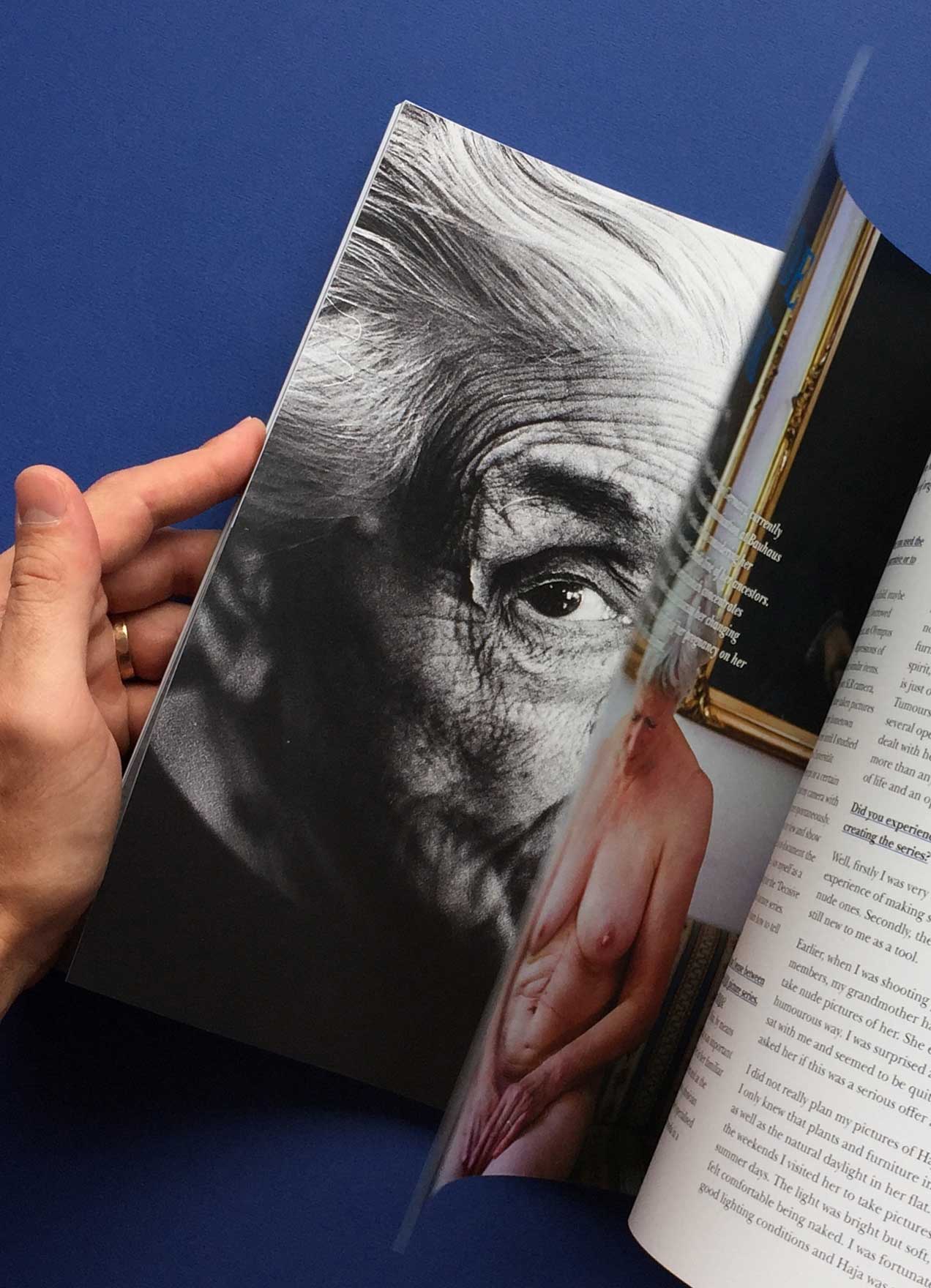
She Shoots FilmVisual Identity, Editorial Design

ArgoNaming, Visual Identity, Print Design

DesigntreeNaming, Visual Identity, Print Design

MerineoNaming, Visual Identity, Print Design

Chapter HouseVisual Identity, Print Design
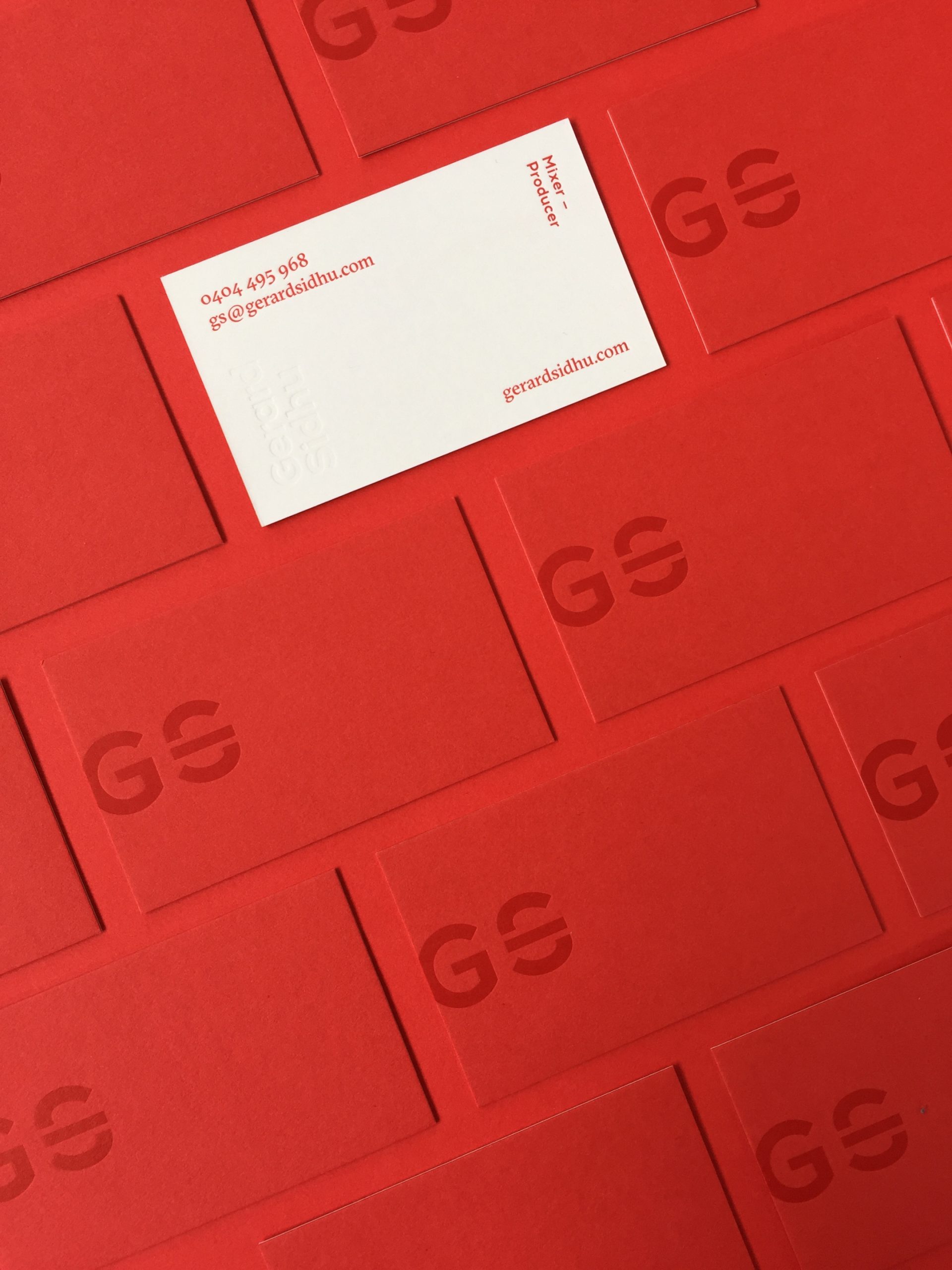
Gerard SidhuVisual Identity, Print Design
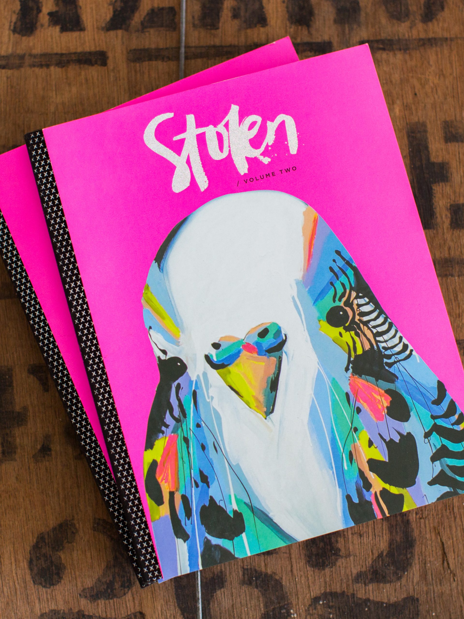
Stolen PublicationsCreative Direction, Visual Identity, Editorial Design